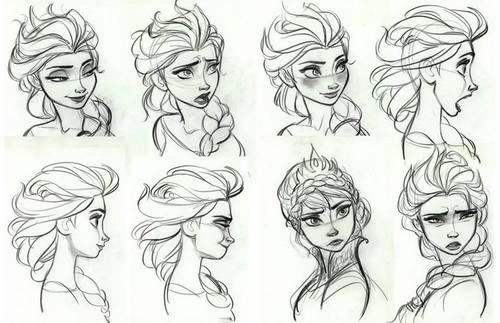
(Wayne Unten, Supervising Animator Elsa) Seeing this artwork, I wish that Frozen (2013) had been a hand-drawn animated film.)
Here is yet another list of my favorite character designs. I actually didn’t think many people would read this, because it is just me blabbing about my opinions. For those who do read this, thank you though I don’t know how you have the time. So without further ado. . .
30. Marahuté- Rescuers Down Under (1990)
The best way to describe this Glen Keane character is that out of all of them it best represents the feeling of freedom. The animation and design of this character is incredibly lifelike. Usually when animals are portrayed in films, they are cartoony, especially with their eyes. They aren’t lifelike. Marahuté truly looks and acts like an eagle. When she flew, it seemed as if she could step out of the screen. Though he also achieved this with his bear from The Fox and the Hound, I believe that he pushed it to the next level with Marahute’s design. I remember this film as a child and I felt that Cody’s flight with this beautiful eagle was nothing short of magic. I love the work he did for her and how much emotion he could convey through its movements without sacrificing realism. I also love the way she moves her head from side to side and upside down as well as her red-golden eyes.
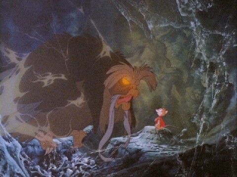
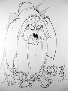
29. Owl- The Secret of NIMH (1982)
I will just get to the point. I love this character because he reminds me of a wise old man trapped within an old palace. He seems to be part of a long forgotten civilization from his feathers shaped like a beard, his glowing eyes, and his cobwebbed body. I don’t like animation done under Don Bluth. I believe when he and multiple other animators left Disney they missed the opportunity to learn and grow under the older animators. Learning the art of animation doesn’t happen in just five years. Before they made the older classics like Snow White and the Seven Dwarves (1937) and Pinocchio (1940), the Nine Old Men among others worked for many years on animated shorts which slowly brought them to their level of expertise. Not so with the films made throughout the 60’s and 70’s. Think of those films as their steps towards the beauty of the Disney Renaissance films. Anyway, despite my opinion of Don Bluth and the animation of his films, I do love the work they did on the character designs in NIMH, especially the owl. He looks wise, and even a little other worldly compared to others in the film.
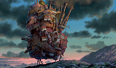
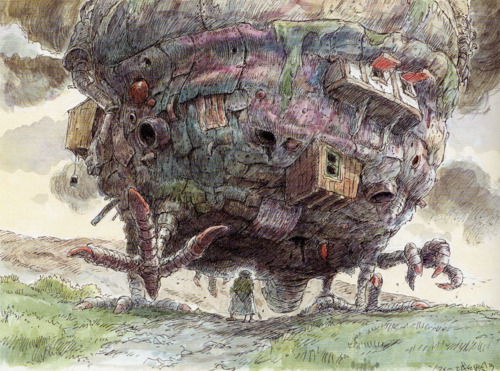
28. Howl’s Castle- Howl’s Moving Castle (2004)
This counts as well! Designed again by Hayao Miyazaki, this character is a moving house made from scraps that look like they are from a junkyard. It looks and acts like an amphibious creature. It is a mess of complicated bits and pieces and I love it for it. When I saw this movie for the first time, I felt somewhat overwhelmed by how it looked. I can honestly say that I have NEVER in my experience with film seen anything like it before. Nope. Never. How Ghibli created this phenomenal character is so incredible to me. Using computers, they took multiple painted pieces, like a puzzle, and put them together in order to show its messy movements. Animating a car is hard. Imagine putting together this house and not only making it move well but also look like a work of art. This is an under appreciated achievement and film.
27. George/ Meg- Paperman (2012)
I love the design of these two characters, as well as the short. (I recommend you watch it if you haven’t). They both reminded me of the character animation done in 101 Dalmations (1961). In fact, I was exactly right because this short’s director, John Kahrs wanted the to look somewhat like Rogers and Anita from the earlier film. Kahrs wanted the main couple from his short to have a hand drawn quality to them mixed with 3D effects. Heh, here’s the funny thing, Glenn Keane did Meg’s design. I didn’t know until I started writing this blog. I swear! No wonder I liked it. (In fact, Keane’s character designs for Rapunzel in Tangled (2011) inspired Kahrs to make this short in the first place) Ahem. . . For Meg, I love her flowy hair especially in the second picture I have listed (I just adore how it swishes!) I also love how open and kind her eyes are. As for George, heh here’s the funny thing. . . its his nose I like and his thin frame. ( I told you I like big noses) His eyebrows are also very interesting to me, where they make him look so serious yet soft, especially as he stomped down the sidewalk.
26. Mulan- Mulan (1998)
Out of all the Disney Princesses, I like her design the best. Her face is open and easily conveyed strong emotions. She isn’t traditionally beautiful, but simple. Though simple, she was no less poignant than heroines in other films. In fact, in many ways she looked and moved more strongly because she had to look and act like a man. I liked when she made decisions because her eyes sharpened, determined and unmovable. I like it best when she is in a dress actually, especially as she walked. It had an artistic, sharper look to it. This is probably a result of the style Disney animators adopted for the film, which gave everything, even the characters an artistic Eastern edge to their features and movements (like the smoke and fog). Her hair was also an interesting feature, because it was black and flowed in a gentle way. (Pocahontas had similar hair but I don’t like her as much as I do Mulan) Overall, her design and character seemed to me like a stone. (I think Mark Hamm was in charge of her design but I couldn’t find out for sure).
25. Aisling- The Secret of Kells (2009)
I love the animation for this whole film. It moves like the art from age-old scripts drawn by clergymen, with swirling designs and beauty. Aisling is the character whose design and movements best reflect the freedom and splendor of this film’s art style. I believe the director Tomm Moore is responsible for her and the other characters designs. (Don’t quote me on that though.) Technically she is a human-like girl for most of the movie, however it doesn’t seem that way. I love her long white hair, the same hair she has as a wolf, her piercing green eyes and strangely shaped shoes. What impressed me the most as I watched this film was how she moved, specifically how fast she was and how she always looked like she was dancing. Everything in her movements looks rounded, almost like a shell.
24. Eris- Sinbad Legend of the Seven Seas (2003)
(I couldn’t find who did her design. However, Seth Engstrom and David James were in charge of the film’s Art Direction) My love for her design is simple: everything about her constantly changed, swirled and blended together. Just like her nature, her design reflected her unstable form and love for chaos. Her eyes are intriguing because they seem feyish, being red and yellow. Her skin color is also very interesting to me. It was tinted grey. I wonder if this is because she loved the idea of death. Everything about her had a feisty strength to it, clever, calculating and unstoppable. I also like how her nose is more pointed and her hair is jet black. She must have been very hard to animate because so many things from her hair to her cloths were always in a state of motion.
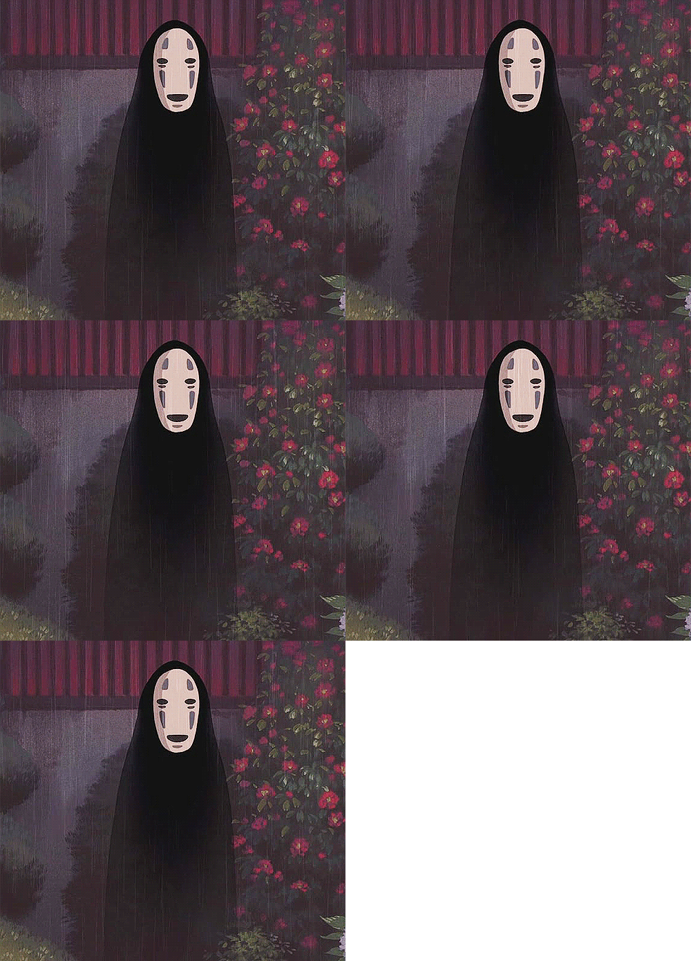
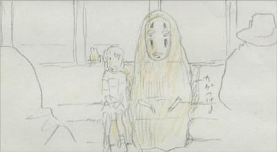
23. No Face- Spirited Away (2001)
I know what you are thinking. “This character has no features to admire!”. Well, there you would be wrong. There is strength in simplicity. How much can we learn about this character the first time we see him? Hardly anything. He has no form, no face, and wears a mask to hide his starving nature, born no doubt from loneliness. His looks give away nothing. It is only through watching him carefully that we learn who he really is. Maybe that is a little too poetic. Regardless, I love how much character this shapeless blob of a spirit had! His form doesn’t stay the same either. As the film progressed, he took on the features of those he had eaten and when he received the medicine from Chihiro he became an incredible monster overcome by the bathhouse’s gluttony. This character’s design and conception is brilliant! That is the best I can say. (By the by this is a Hayao Miyazaki character.)
22. Howl- Howl’s Moving Castle (2006)
Here is yet another Hayao Miyazaki design. Again, I hadn’t planned on putting him on my list, however, when I stopped and thought about it I realized I absolutely love the way Howl looks in this film. This story is based on a highly popular fantasy novel by the same name, but Howl is very different than the character in the book both in the way he looks and acts. In the film, He always looked like he was viewing the world from a safe distance, detached and perfectly groomed. That changed, however, when he met Sophie. As far as his design goes, I like his long longs, tall stature and his kind eyes. His eyes start out clouded and far away at the beginning of the film then slowly grew darker, almost as if he was finally paying attention to his surroundings. As he changed, it was always subtle and multi-layered. Everything about him is calm, straightforward, and elegant. I like him best when he turned into a bird, but still retained some of his human features. All in all, he seems to me like the perfect fantasy character, entrancing, graceful and intelligent.
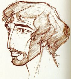
21. Moses- The Prince of Egypt (1998)
Moses is a character of change. Throughout the film, he design switched three times as an adult, each time representing a different moment in his life. When first shown, he was dressed as an Egyptian, even with a black wig to hide his ethnicity. Once an outcast, he threw away his wig then a battered, damaged man. The greatest change came when he lived with the Midianites and allowed his hair to grow, showing for the first time beautiful curls. I say all these things to reiterate the nature of his design and the brilliance in its conception. His head designer, Brian Clift, did a wonderful job capturing a maturing man, strengthened by the tragedy in his life. I like him best when he no longer hides his true ethnicity. I also enjoy seeing the sharp lines in his face and hands. Dreamworks made The Prince of Egypt, their first animated film, to show that animation is not meant for only children, that it should be taken seriously. In the case of character design, especially for Moses, they definitely achieved a maturity lost to many more cartoony films.
If you are interested, here are my other posts: Memorable Designs 50-41, Memorable Designs, 40-31

