

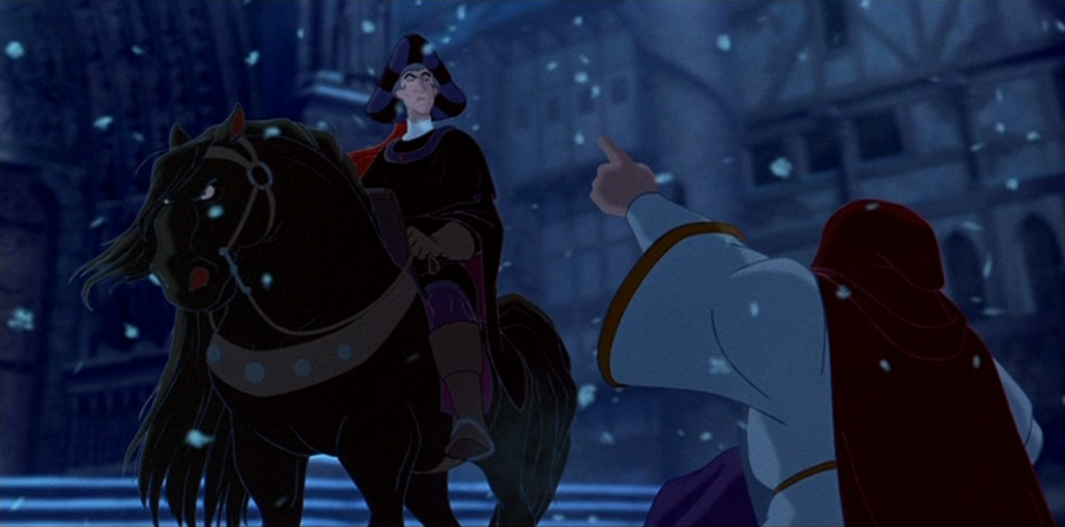
41. The Hunchback of Notre Dame, 1996
Some of you may be surprised this is not one on my other list. It almost made it. Visually, this film does not disappoint. From the numerous perspectives of Notre Dame inside and out, to the vibrant colors of the Festival of Fools and especially the dark ambiance of Frollo’s “Hellfire”, it is guaranteed, especially for the Renaissance history buff, that this film will entertain.

There is only one reason I took it off my other list: the 3D animated crowds and the shortcuts they took with background character animation. I have this habit when watching movies. When I have seen it many times I let my eyes wander from the main action to the backgrounds. Sometimes, like in masterpieces like Spirited Away (2001) I am amazed by the amount of effort put even into background animation. Unfortunately, the 3D crowd in Hunchback made me want to bang my head against something.

Does that mean this film is not a masterpiece? No it does not. In every other aspect, it goes above the usually Disneyesque stereotype people think exists. But, for the purpose of this list, it does not quite fit into my other list.


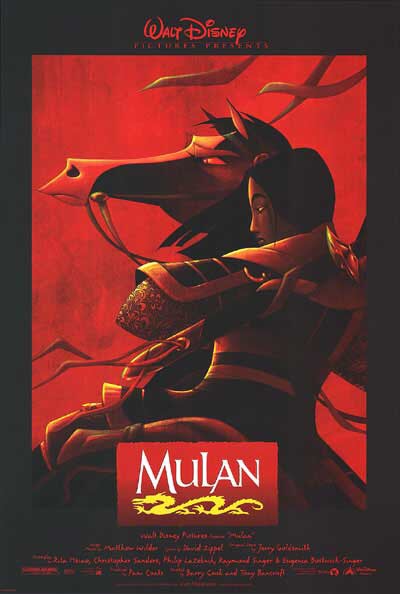
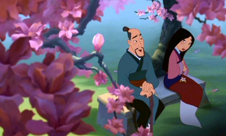
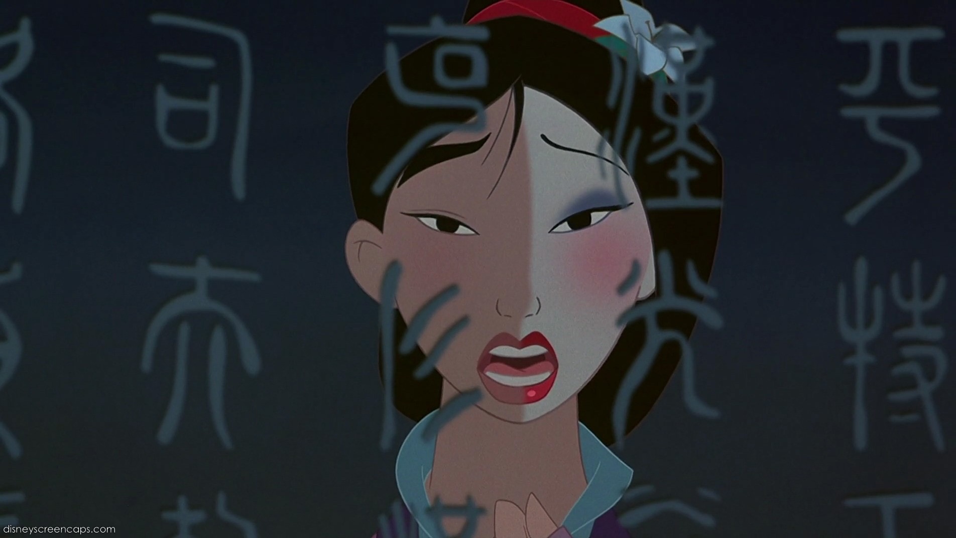
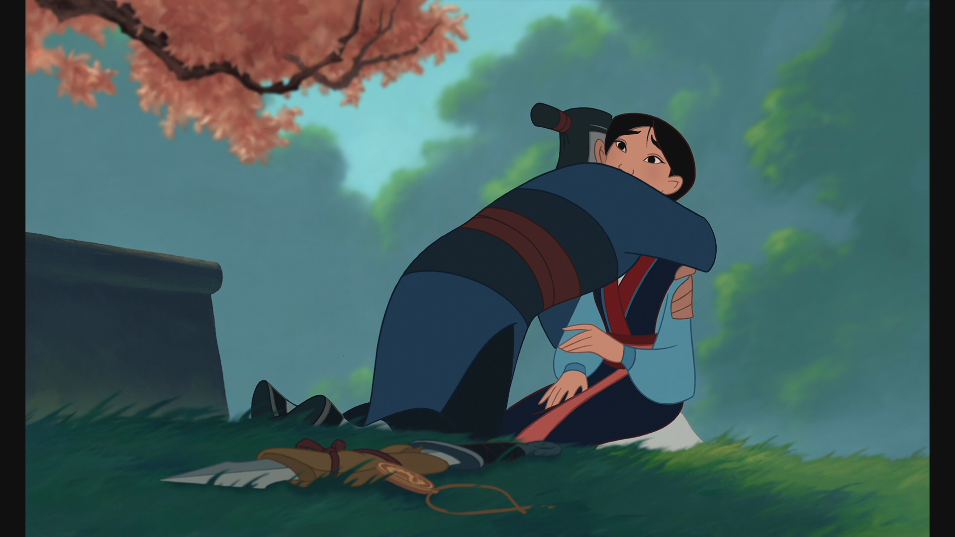
40. Mulan, 1998
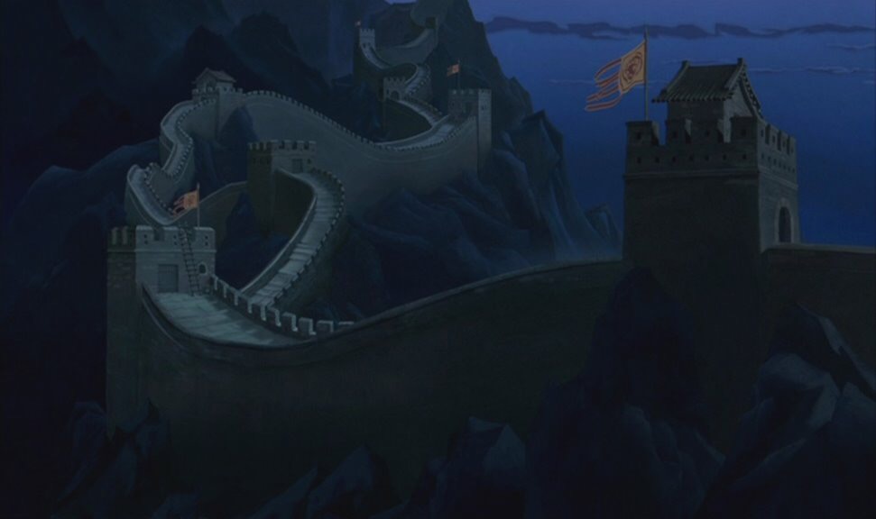
This is an interesting film. I watched it for the first time on my mother’s birthday when I was seven years old. I loved it, particularly because of Mulan’s relationship with her father. The art director Ric Sluiter, and Head of Backgrounds Robert Stanton fought to give this movie a proper Chinese setting. To do this they studied Chinese painting and watercolors to match the Ming and Qing dynasties (about 1644 AD).
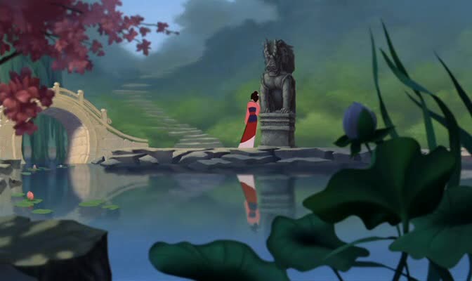
This movie is very subtle visually. The colors and images never scream or divert attention away from the main action or dialogue. Much like Chinese Art, the backgrounds were simple and evasive. In my mind, though it is visually nice, it is several steps away from being brilliant. There could have been more drawn in to emphasize the culture and beauty of Chinese architecture and nature. As it is, there are only subtle hints of it in places.
For all it is, at least its style and background is different from all other Disney films past and present. My favorite part of its imagery is how they designed smoke and clouds in swirls and pretty colors.


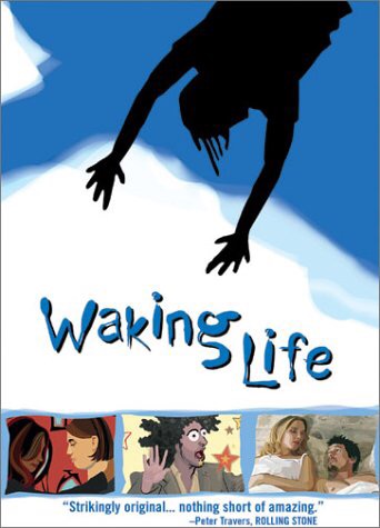
39. Waking Life, 2001
Here is another rated “R” movie I will never see. Even if it was not rated so high I do not think I would ever watch it. The reason? I do not like rotoscope animation. Whether it’s the Walrus animated over Cab Calloway in “Minnie the Moocher” or scenes from Ralph Bakshi’s The Lord of the Rings (1978), I always feel there is a severe disconnection from the magic of traditional animation. Is it a cool technique? Sure. But for me, it is crude and disconcerting visually.

From what I can tell, the creator Richard Linklater used this style of animation to emphasize how unstable dreams are. Even when we wake, reality shifts and questions a person’s perspective on time and place. This definitely shows through the visuals. The images remind me somewhat of Impressionistic art, where all figures look somewhat distorted as a result of lighting and small brush strokes. (In other words, the reality in the painting looks as though it is seen through a haze or smudged lenses.)
I admit there is a otherworldly feel about this film’s visuals. However, they just do not impress me the same as other films. I cannot recommend or deter from watching the movie but I can say that at least, in the wide scope of animation, there is nothing as unique as this film.


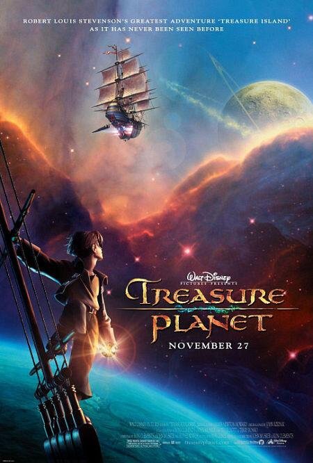
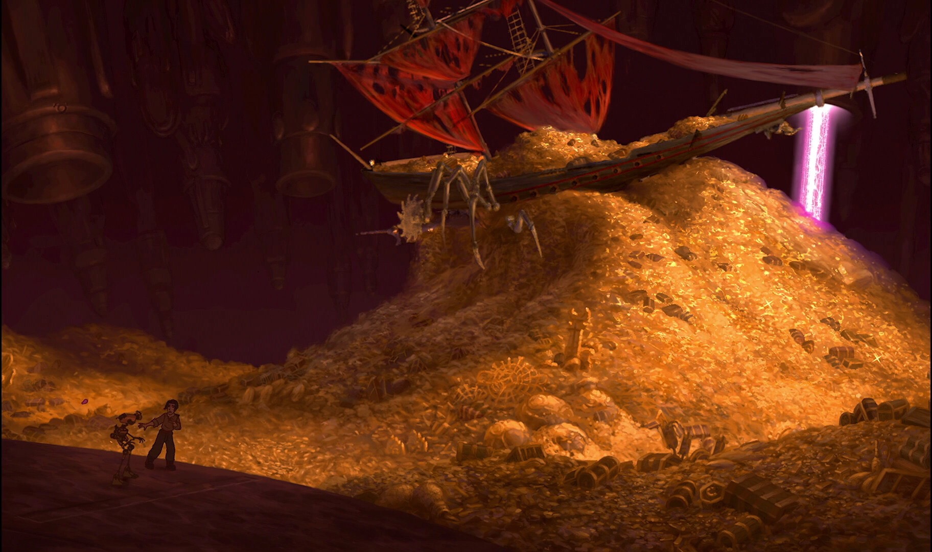
38. Treasure Planet, 2002
This movie could have been so many things. Unfortunately, despite its insane budget and thought provoking setting it failed to deliver well as an animated film. Supposedly 70% traditional and 30% sci-fi in its setting and story, the purpose for its visuals was to showcase a book illustration like quality to its characters and backgrounds. For this, animators used Deep Canvas, a technique created for Tarzan (1999), to give these scenes better depth perception.
I think the imagery is incredible when stilled. But, I do not think Deep Canvas does well with moving objects. Rather than giving things like the ships and sea whales a realistic feeling, I think, again, it took away the magic present in hand drawn animation. For example, Pinocchio (1940) did not need computers to create the immense power and presence of Monstro. Treasure Planet depended too much on computer effects and not enough on its skilled hand-drawn animators.
Watch this movie for its animation. There are wonderful and well done moments like the song “Still Here” but the story, originally written by Rober Louis Stevenson, does not fit well into the sci-fi genre.


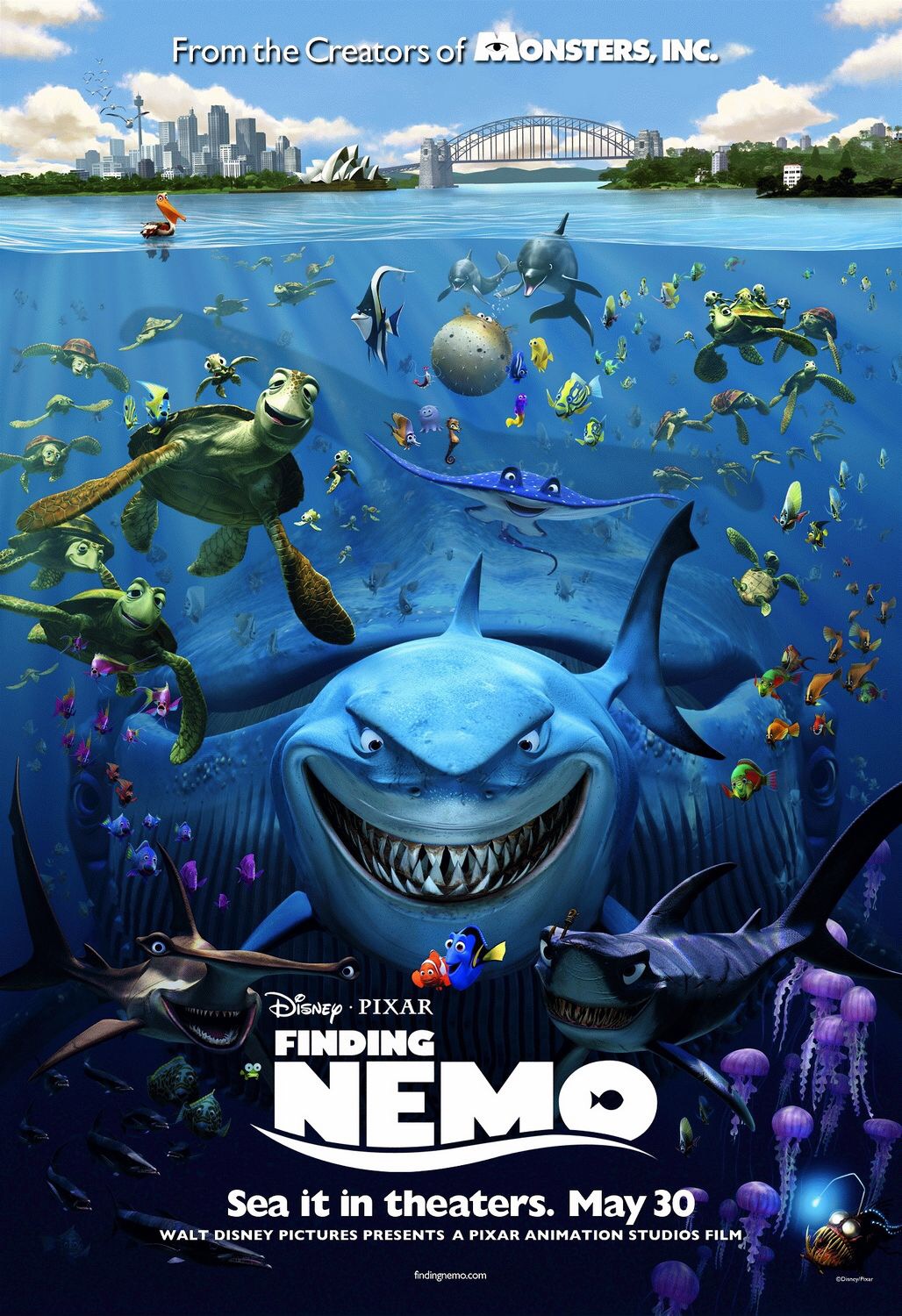
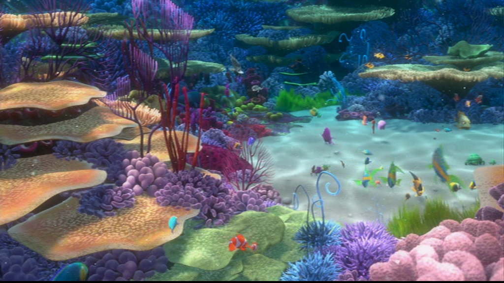
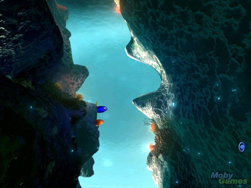
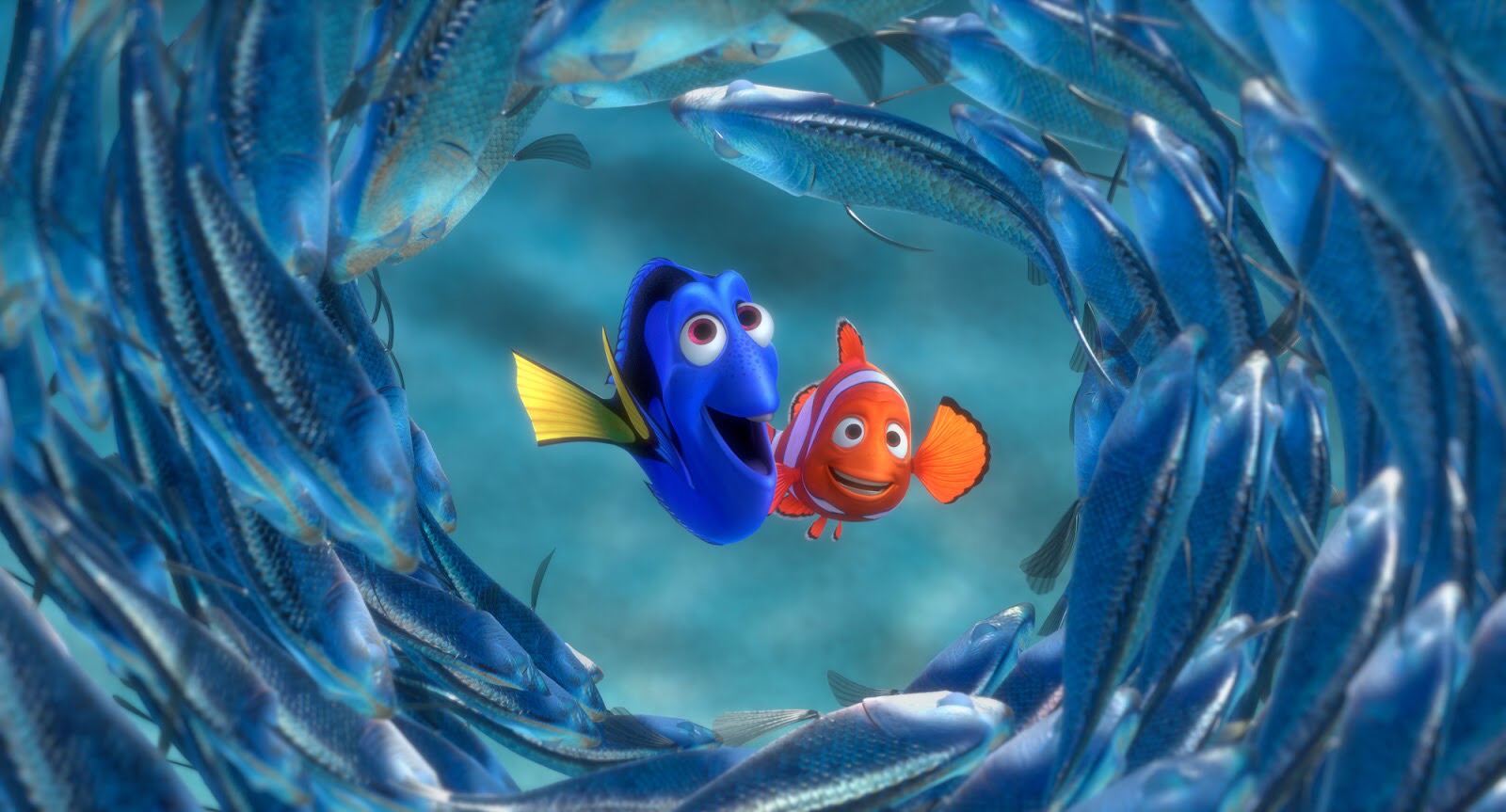
37. Finding Nemo, 2003
I guess I am getting kind of old if I remember seeing this film in theaters. (Not really though. I am only twenty-four.) I loved the story, characters and setting of the movie and thought it was incredibly funny. I do not know who did the art direction, but the director Andrew Stanton played a major part in creating its atmosphere and beauty.

Everything about this movie is fantastic, but it is difficult to ignore how wonderfully the ocean outside of Australia is portrayed. Even the deep sea angler fish had a strange unearthly beauty to it. There is only one reason why this film is not on my personal list. Everything looks as though it is in a haze. Perhaps this was supposed to emphasize underwater perspective. Regardless, it downplays the visual’s potential to me. But only a little.

If you have not seen this movie stop what you are doing and find it. It is an incredible watch visually and a masterpiece of storytelling. My favorite scene visually would probably be the one with the jellyfish.


Brilliant post, I always like hearing people’s perspective on animations regarding the actual animation. Makes you look at it much differently, and because I am in no way well versed in the ways of film and animation I feel like I am learning something. Well written.