
 (Concept maps for the Looney tunes character Bugs Bunny)
I am so sorry I haven’t posted for a long time. The last week of school killed my energy and schedule. That aside, here are my last ten character designs. I will do other lists for my memorable moments in animation, however this list has caused me to reflect on a lot of things. I noticed that I lean more towards mature designs and that I am fascinated with how these characters come to life.

(Concept drawings for Coraline)
For my last ten characters, I provided more pictures and will talk a lot more about them. I doubt many will take the time to read my thoughts in depth, but at least I have a chance of letting go of a lot of stress I build up teaching middle schoolers.
 (Concept sketches for The Lion King)
If you have any that you like or want to share with me, feel free to write me. I do not have nearly enough followers to expect such things but I want to leave it open just in case.

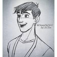
(Jun Kim sketches of Takashi, Big Hero 6)
So without further ado here are my top ten character designs.
10. Tack- The Thief and the Cobbler (?)Howard Blake Corny Cole John Culhane
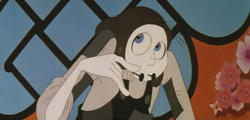
When I first started this list, I forgot how much I love this simple yet dynamic character. At first, I had him placed near the bottom of the list but then I realized that he is among my favorite designs. If you are an adamant fan of animation, you are most likely aware of the torrid history of Richard William’s The Thief and the Cobbler. I have loved this movie since childhood and one of the main reasons is because of this character. If you are familiar with Middle Eastern philosophy and storytelling, Tack’s transformation from a pale, wide-eyed young man into a mature man is not too surprising. Oftentimes in stories such as “Aladdin”, “Ali Baba” and others from A Thousand and one Arabian Nights the main male character transforms from a nobody to someone of high importance through the help of magic and needed experience. This is usually portrayed most through their physical appearance, as an outward reflection of their inward change.

Like Moses from The Prince of Egypt, Tack is a character of change. In the botched 1994 film, Tack has a voice throughout the whole story and acts as the narrator. In Richard William’s intended work, however, he does not speak until the end. Everything the audience knows about this character comes from his appearance. It is strange because I found that much more endearing. His transformation seemed whole and complete because with his first and last line he was believably a different man and no longer a pale nobody.

Now we come to his design. All of his character and personality came from his actions and appearance. I love his tall frame, large blue and expressive eyes and simple smile emphasized with tacks. He also has very nice long fingers and a cute hat. More than that, I love how his appearance nonchalantly took on different forms. As the picture progressed, he gained added color and depth. I remember talking to my brother Spencer when I was younger about this bizarre change. He surmised that the more involved Tack became with others, the more he changed physically. By the end of the movie, you can hardly tell that he is the same person.

What I love most about Tack, the Cobbler, is that everything about how he looks is soft, gentle and even graceful. I have a soft spot for men like him who do not turn to violence, dirty language or other crass behaviors. I think the idea of these stories is to show that who we truly are is not initially portrayed through appearances. Only experience can tell the purity and clarity of the soul. That is the essence of Tack’s design and I love it.
9. Hisoka, Hunter X Hunter 2011-2014 (Designer Yoshihiro Togashi)
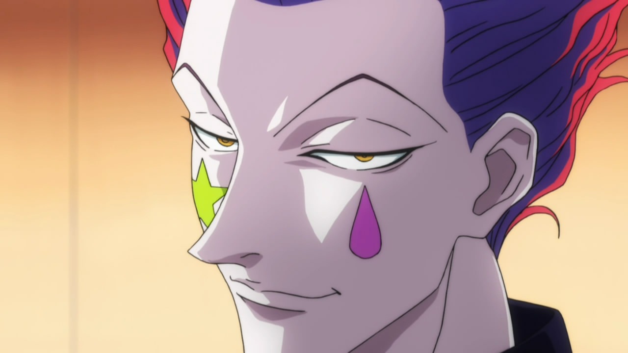
This is one of only two anime characters I have on my list. As a rule, I do not like generic characters and I am sorry but most anime characters LOOK THE SAME and have the same design as one Japanese icon or another. That said, there are some exceptions (There always are). Hisoka, from the newer version of Hunter X Hunter (2011), is definitely one of those. Though most of the designs in the 2011 show are unique, Hisoka is by far the most interesting. He is a character, much like those in the Alice in Wonderland spinoff Pandora Hearts whose guises denote the innocence of childhood but are dark and twisted, who hides his calculating and evil nature through playful makeup and costumes. Everything about him is meant to trick and manipulate. Trying to understand the man underneath such an appearance is utterly fascinating to me.

When I watched this show for the first time, Hisoka in design and personality caught my attention immediately. Some who know this show may find that shocking seeing that he is a narcissistic, murdering psychopath. I do not like him for that reason. Rather, his motives interest me as well as his appearance. Again, as a rule, he always seems to hide behind some guise that usually should be seen as playful or merely mischievous. This is usually done when he takes on the dress and makeup of a clown. His design in the newest anime is definitely better than in the manga, but I praise Togashi-san for his brilliant work as the manga artist who brought this character to life.

Everything about his character is sharp, intense and intelligent. As a whole, I would say he is single-minded and unable to move beyond his own desire for proving his invincibility. Fighting is a game, which is why no one really can or wants to understand him. (Doing so will ultimately result in their death). As for his design, in the 2011 show I love how they created his sharp insanity. His eyebrows have a delightful edge to them as well as the rest of his face. His eyes are also very entrancing in color and shape in how they slit upward. When I watched his fights with multiple characters in the show, I also reveled in the graceful lines in his animation. His overall color palet is also interesting. I like the animator’s use of reds, yellows, blues and blacks. If you are interested in seeing some of his animation you can follow this link ——-> CLICK HERE (Warning! It is in Japanese, but I hardly think that matters if you are interested in the animation).

8.Fat Horse- What’s Opera Doc, 1957 (Designer, Chuck Jones)

Surprised you did I not? I have established I love plushable, round designs and this one takes home second prize for best rotund character. Every time I watch the short I laugh until I cry when this horse gallops down the hill. The best part though was when the horse actually sat down and the audience was given a full view of its tiny legs swallowed by the horse’s fat body. This is the shortest overview I will give. Just know that in the annals of cartoon history this is the most memorable for me. This is a character that has all the designs of one who should be taken seriously but oversteps its bounds into the pleasurably ridiculous.


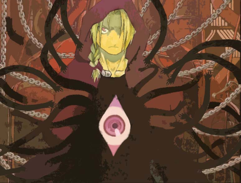
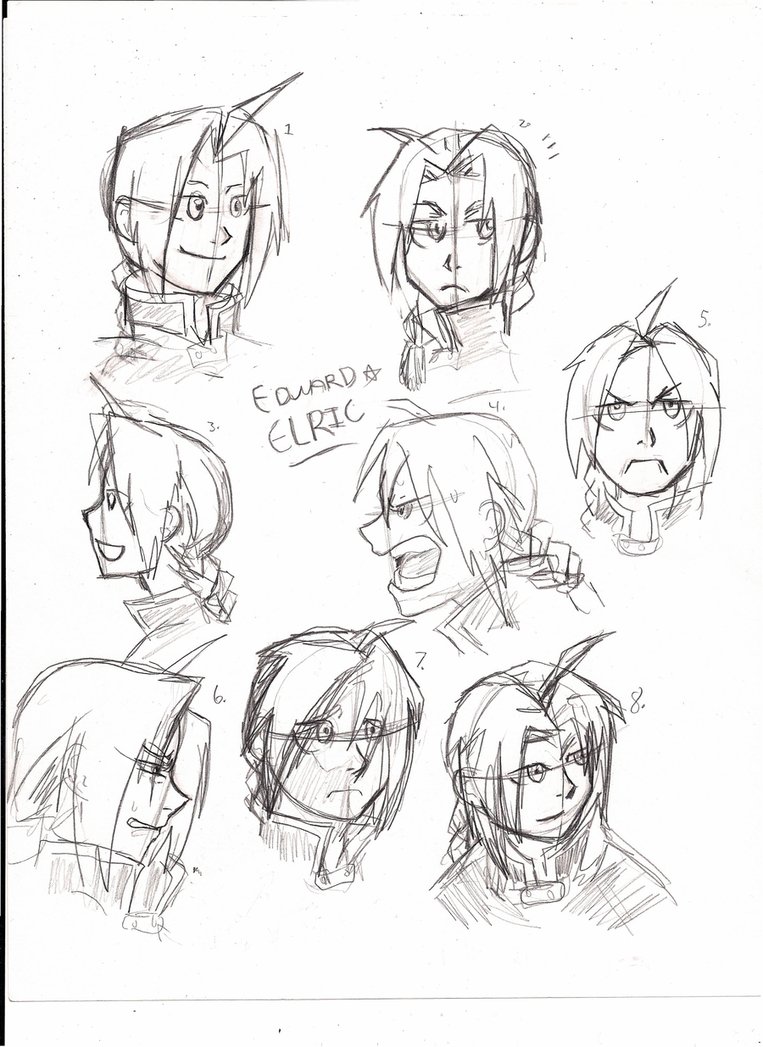
7. Edward Elric, Fullmetal Alchemist Brotherhood, 2009-2010 (Designer, Hiromu Arakawa)
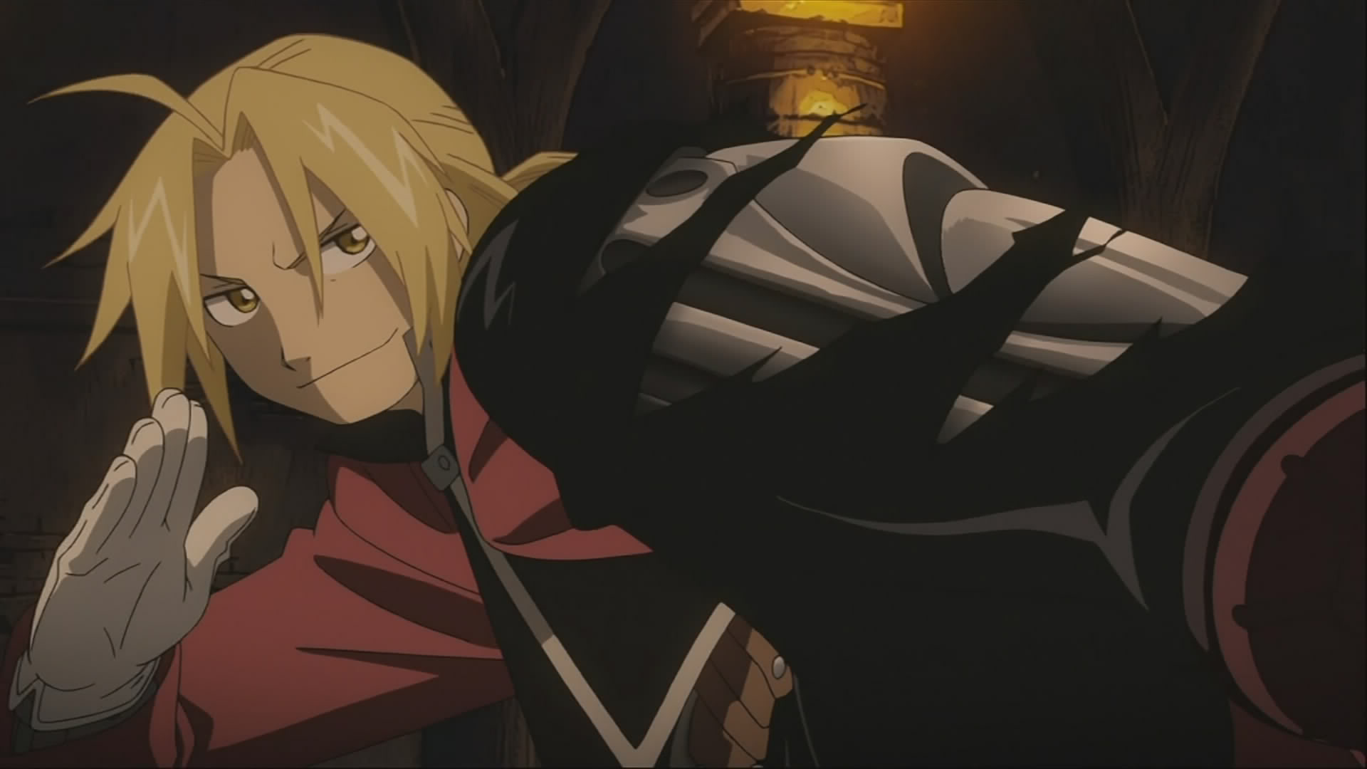
The second anime design was done by one of my favorite authors, artists and thinkers Hirimu Arakawa. I could have listed all her characters on this list but I opted to do my favorite Edward Elric instead. Her understanding of the human body and her ability to transfer emotions, personality and depth through her art is quite remarkable. It is through Brotherhood where this transfers the best through animation. The show does an amazing job of taking her original designs and giving them voice and action. Again, I could say this about all her characters but Edward is my personal favorite.
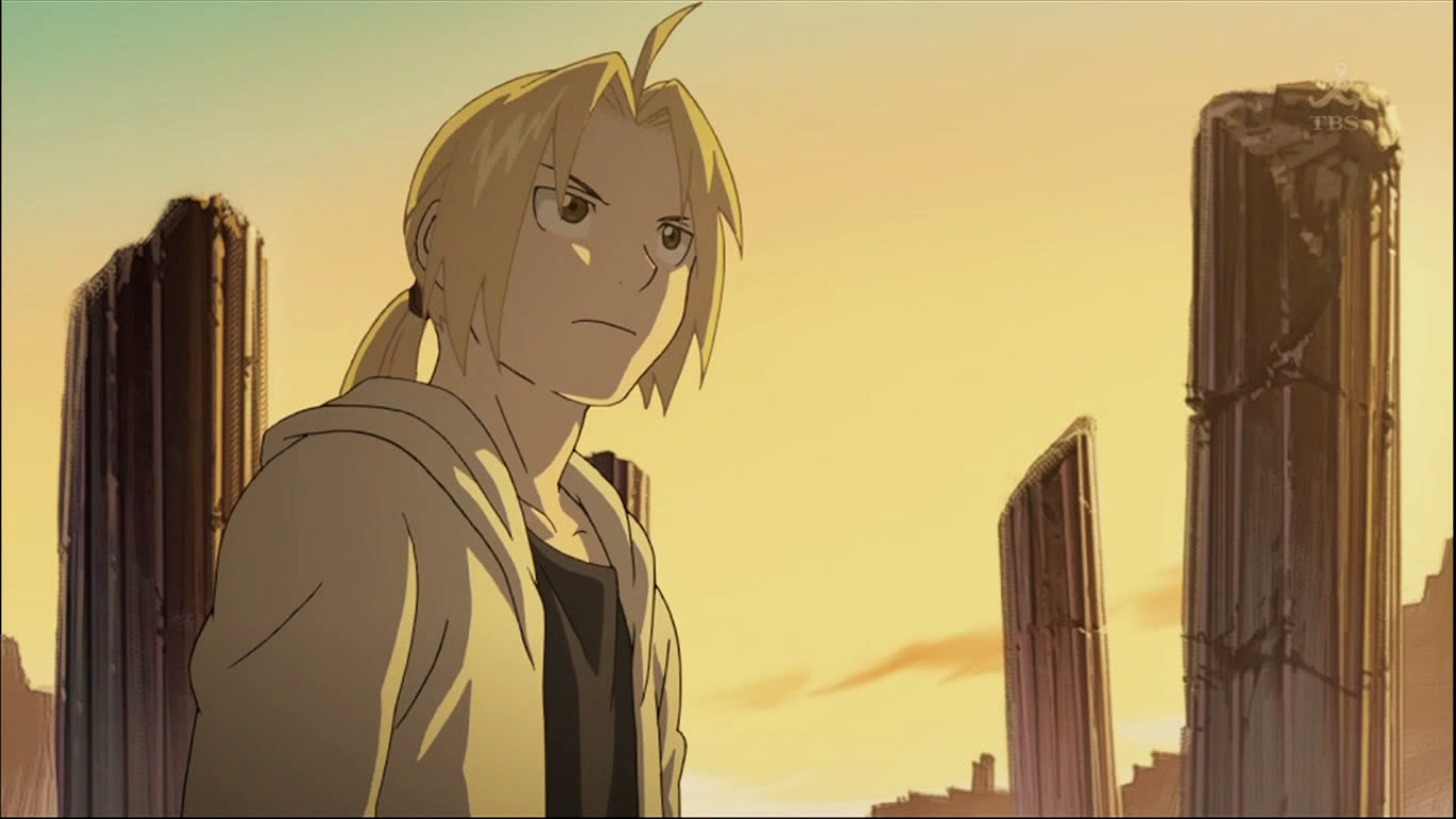
Someday when I do a favorite movie characters list I will talk about his character more, but for now I want to focus on his appearance. Specifically, I will focus on how it reflects his personality. As a character, Edward is a very passionate individual still physically growing into himself. When the audience is first introduced to him, though he is only fifteen, he speaks and acts more like an adult. In other words, he is a child with an adult’s understanding. Because of traumatic childhood events, he was forced to put aside youthful innocence in favor of needed maturity. This had to be reflected in his design, especially since he and Alphonse are surrounded mostly by adults and not children. Sometimes, I forget that Edward is still technically a child throughout the series.

Putting this to animation, the show’s creators had to find a way to reflect his maturity and absurdity without making it too obvious. If they had given Edward a bulkier body and height (Sorry Edward) it would not have worked. I LOVE eyes in Japanese animation because of how well they reflect emotions and personality. Likewise, Edward’s eyes hold the key to his passionate depth. If you are a fan of the show, pay special attention next time you watch to his eyes. What I like about his in comparison to other anime characters is the color and shape. They aren’t too wide (trust me, there are some characters in anime whose eyes take up HALF OF THEIR FACE) and curve pleasantly enough to balance with his intensity. His face shape has nice round curves to it as well.
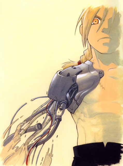
The most interesting thing to watch in regards to his design was to see how he grew into his body. Eventually, his maturity finally matched his appearance and his expressions and actions grew softer. Also, his body structure is soundly based on true human anatomy, even in how the auto mail (robotic, synthetic limbs) fit into his nervous system. The attention given to the minutest details of his body is one of the sadly overlooked aspects of this show. (The minute one slaps anime or cartoon on a show it is automatically assumed to be childish.)

I listed Edward in hopes that some would become interested in this show. Watch this link ——–> CLICK HERE to view a clip portraying some of its animation and character design. (DON’T DO IT WITH THE SOUND!)


6. Man and Woman- Duet 2014 (Designer, Glen Keane)

For those who read my posts on this seven-minute short, you understand why I have these characters are here (link ——> CLICK HERE). Animated completely by Glen Keane, this short focuses on the life of a boy and a girl whose lives slowly draw together as they grow up. I love their design because they showcase the animation PROCESS, specifically hand-drawn, and how easily it shows change and growth.

This short flows with such beauty and grace. Every second of animation is accompanied by 60 frames of pictures hand drawn by Glen Keane. Every change the boy and girl go through as they grow older seems so natural even though years are literally flying by before our eyes. This cannot be accomplished so naturally in any other medium of film. The entire clip seems like a memorial to the dance of life and love. The key players always highlight the clip as the backgrounds shift and form around them.
As for the designs, the characters resemble best those in his father Bil Keane‘s cartoon strip The Family Circus but with Glen Keane’s own personal touch. The eyes especially remind me of the strip in how they lack true depth. Now as for their bodies, I love how they move and flow as they undergo the changes set by time. The girl is especially fascinating to watch. In one two to four second strip she grew several years older as she leapt into the air and fell to the ground.

The style is gentle, peaceful and full of love no matter where the clip takes the audience. These characters are especially verbose and by its end I was moved to tears at their beauty. They stayed with me because they reminded me the joy of living and finding love. There is nothing more I can say about their design beyond these things. This is a time where you really need to just go and see for yourself why they are so amazing. Here is the link ——-> CLICK HERE.


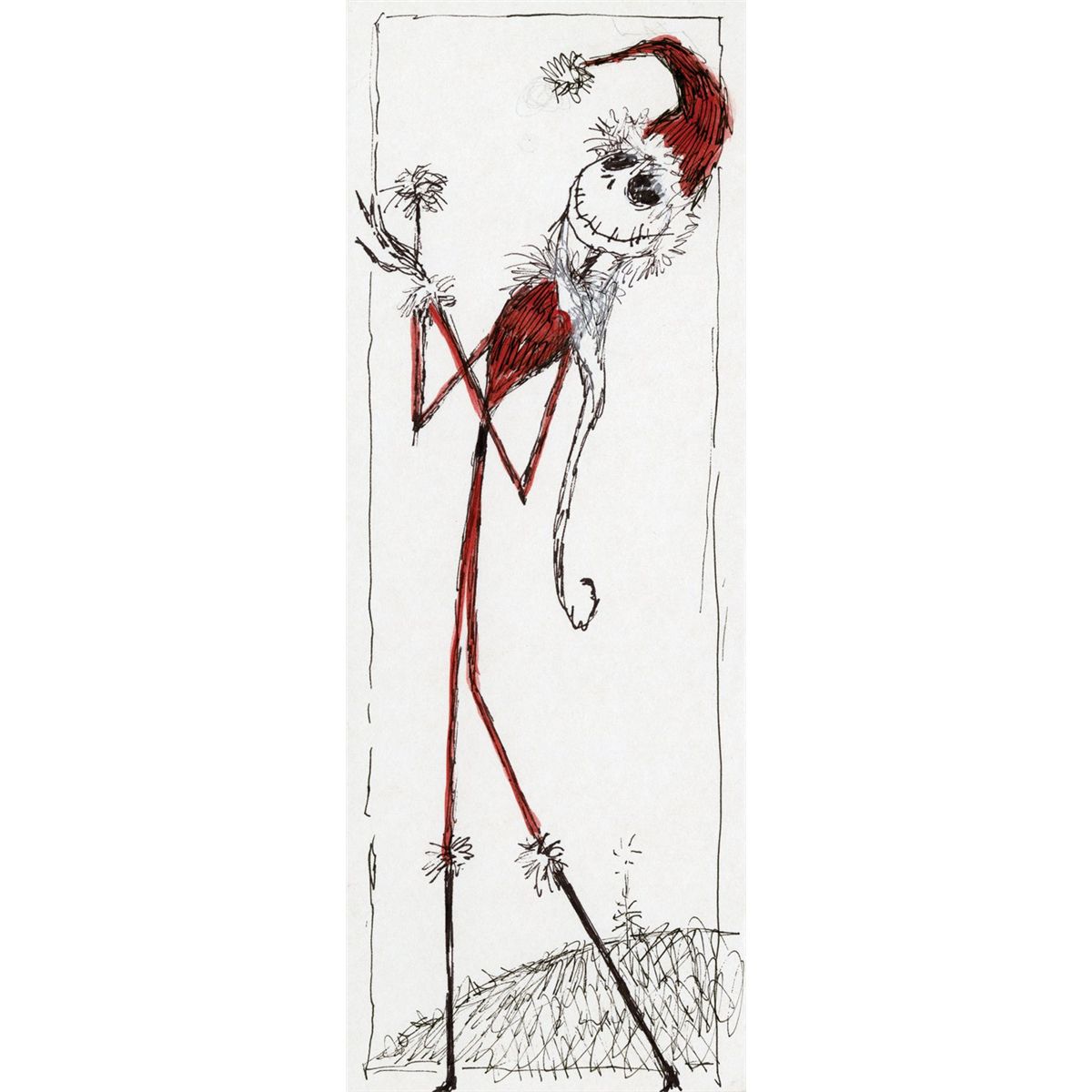
5. Jack Skellington- The Nightmare Before Christmas, 1993 (Designer, Time Burton)

Tim Burton is not my favorite film director. There, it is said. Though I love Edward Scissorhands (1990) and The Nightmare Before Christmas, none of his other films do anything for me. His style, when done right, really hits the spot for me and my German soul which accounts for my admiration for Jack’s design. I have always had a thing for the macomb as long as it doesn’t overstep itself in its morbidity and doesn’t talk about cannibalism. Nightmare works as a film because its stylization (Roots, The Cabinet of Dr. Caligari 1920) fits the theme of Halloween town. If taken out of that setting it isn’t believable, as it shows in Burton’s other films.
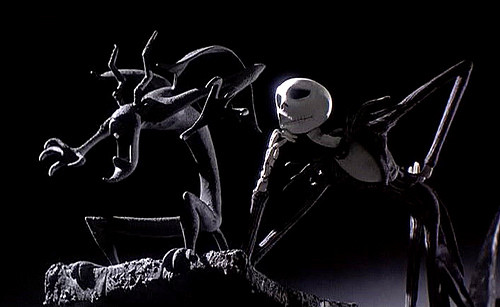
As for Jack, his design fits into the German Expressionist backgrounds well with his long spidery form and offset features. He is obviously skeletal and though the master of such a horrifying place, the scares and screams are reserved for the joy of his holiday. He is actually a very gentle person, unhappy where he is. What sets my love for Jack’s design is actually his face. Though technically not a traditional form of animation, still motion characters bring us closer to real life figures, especially in how animators observe the small details. Though Jack doesn’t have eyes, skin, nerves or anything closely resembling a living body his expressions are constantly changing as though he does. As a character, he is not evil but rather a little lonely and lost in his world. Misunderstood, to be precise. Therefore, whenever he sings “Jack’s Lament” and his other solo pieces it is like the lost soul trapped inside comes out through his facial features.
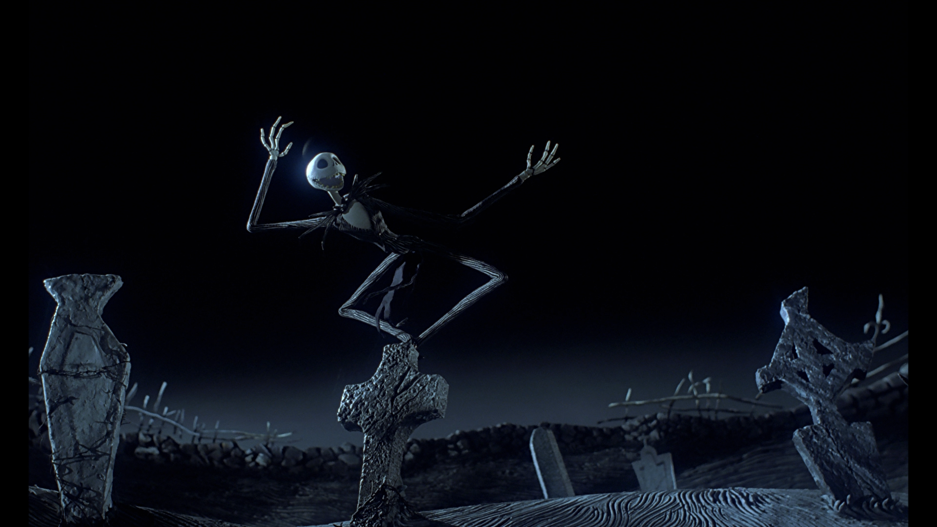
I have always thought of him as rather elegant in the way he walks and carries himself, which also really appeals to me. Whenever Nightmare went to Broadway I couldn’t’ get past how uncomfortable I was with Jack’s change of appearance. Granted the makeup artists did a thrilling job changing the actor into the skeletal being but it just did not sit well with me. He is not meant to leave the confines of animation because that is where his design flourishes and fits so beautifully. Overall, his coloring of black and white, wonderful expressions and suave stature has always set him apart as one of my favorite character designs.

Notice! He is the ONLY still motion character on my list. I do not like how still motion characters look overall. They are clunky and their texture doesn’t fit well aesthetically into the mode of animation. Jack is the one exception because his design defies the usual limitations still motion has on beauty. If you have never seen the film here is a clip so you can see his design in motion. Watch this link———-> CLICK HERE.
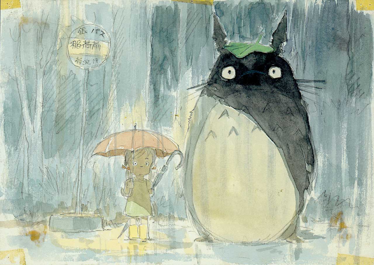
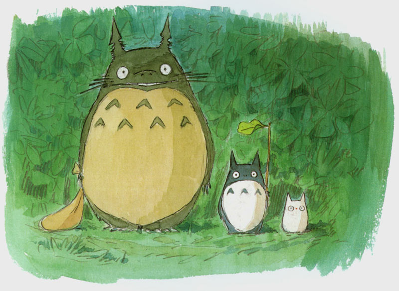
4. Totoro- My Neighbor Totoro, 1988 (Designer, Hayao Miyazaki)
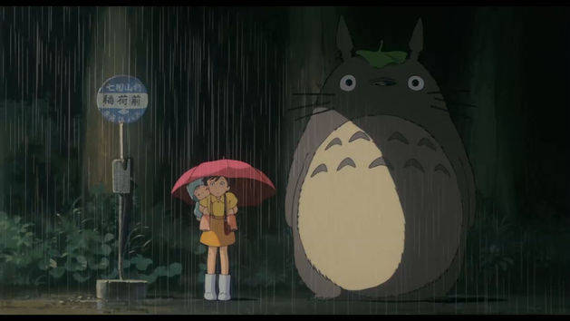
Family and friends you knew Totoro was coming. I LOVE Totoro. I love, love, love him! He is my #1 rotund character of all time! When I was a child, my mother bought this movie for us and I cannot tell you how many times I watched it. (My poor mother. 🙂 ) Normally, you would think a character as big as him would frighten a child such as myself. Nah. . . I was scared of other things like Scooby Doo on Zombie Island (1998) and the rabbits from Watership Down (1978). Come to think of it, Pinocchio (1940) and Fantasia (1940) never scared me either.

Totoro is an all-around lovable character. He represents in a way the innocence of the two girls Satsuki and Mei’s childhood. His eyes are big and expressive and his reactions to simple things like the growth of seeds and water droplets falling on an umbrella never fail to bring a smile to my face. He is part of a world separate from the dirty and dangerous one we live in: a child’s world filled with joy and adventure.

When I watch the film I always look forward to the scenes Totoro appears in because it means that something big is about to happen. With looks drawn between a Raccoon (or Tanuki) and a jovial fat man, I feel that in the annals of movie history, Totoro is one of the most iconic. That is especially so in Japan where it is rare to find any toy store or supermarket that doesn’t sell something with his image on it.

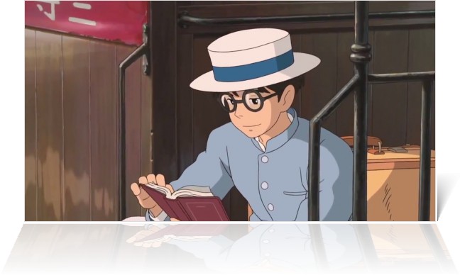
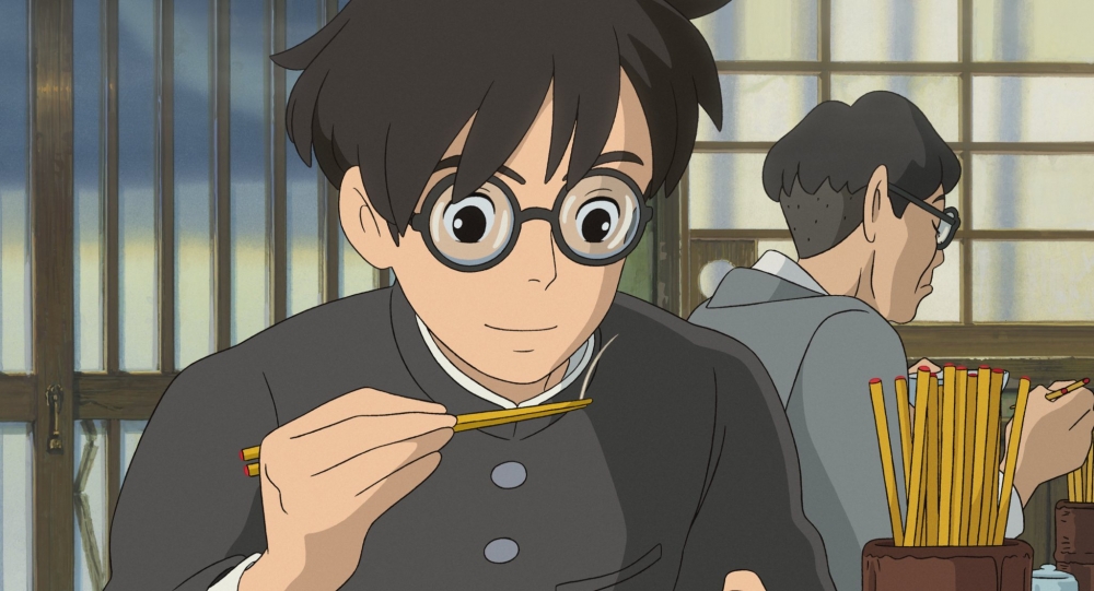
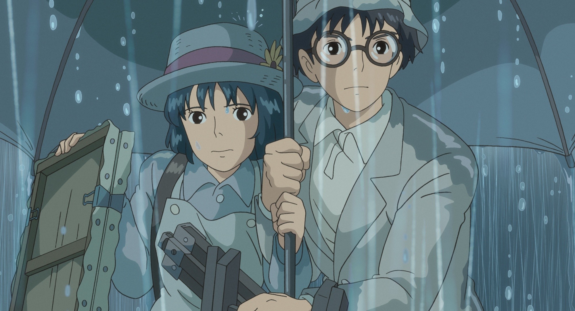
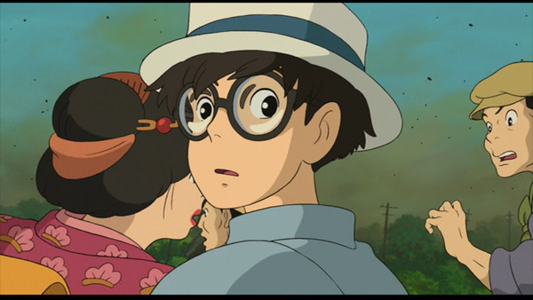
3. Jiro Hirokoshi- The Wind Rises, 2013 (Designer, Hayao Miyazaki)
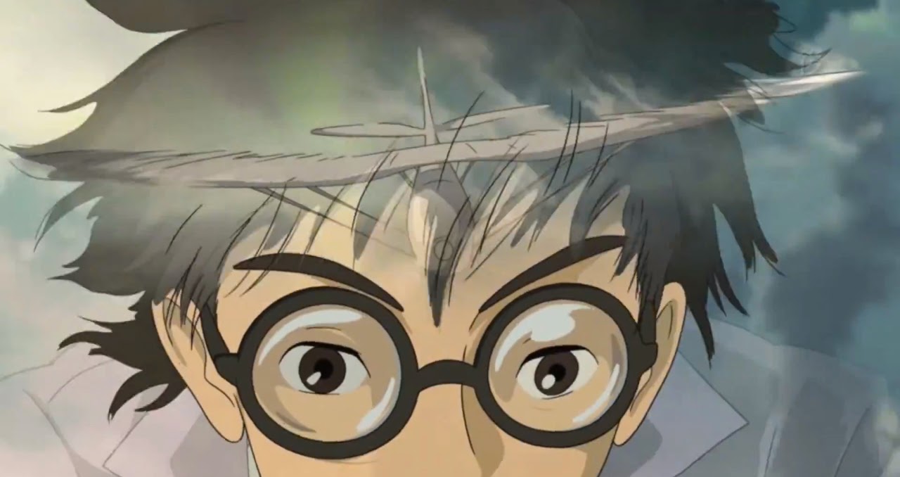
Thinking long and hard, I decided that Jiro deserved to be at the top of my list. Though, again, someday I will write a list of my favorite movie characters I realized that I love his personality coupled with his simple design. If you have not seen this movie, I wholeheartedly recommend it. This story centers on Jiro’s journey as a man and unlike many of the other characters he does not dramatically change in personality.
He is a gentle man from a lost time, someone who despite the sad times he lived in learned to live and dream. I could gush about his personality forever, but that is not what this list is for.
Let’s talk about his design. Like many others from this list, he has a graceful gentleness about him. Unlike others from this list, it is overall authentically genuine. In other words, he feels and looks like a real person not a character in a story. From the way he holds his head to his posture and smile he lives for the beautiful things of this world. Is it too much to say that I felt a kindred spirit nestled behind his eyes? He loved music, classic literature and nature, but he was not overtly handsome. I think most people would pass over him as he is rather ordinary looking. But I have always been drawn to characters like him.

It is because of his plainer, average features that I like his design. He is different from Howl, from another of Miyazaki’s films, because he is not recognized for his looks. To be honest, he reminds me a little of my father, who is also a very soft spoken intelligent man. I like Jiro’s glasses and the way they accentuate his kind eyes. I also love his windswept hair and curved smile.
I wonder if filmmaker’s are afraid to have men like Jiro in their films. That is to say, people are usually more interested in exciting or dashing heroes. I prefer the quiet ones with brown hair and soft mannerisms.


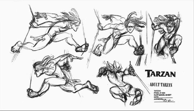
2. Tarzan –Tarzan, 1999 (Designer, Glen Keane)

Tarzan is one of the most complicated animated characters brought to film. Compared to many others, this would at first glance not seem the case. In Howard Greene’s book The Tarzan Chronicles (1999) he surmised that Keane discovered, “Tarzan was one of the toughest characters to draw because he have the most complex costume of all- a functional anatomy” (pg 61). Keane also stated, “It wasn’t just a matter of studying human anatomy. It was knowing how to transpose it into animal movement.” This is a major reason why I absolutely adore Tarzan’s design. Who else besides Keane could have brought to life such a dynamic and believable character?
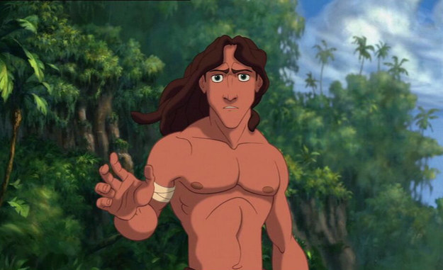
Tarzan in his design and execution is a truly admirable feat because never before had anyone defined the human spirit, even when locked in the confines of animal behaviors so eloquently. Unlike the movies of old, Keane and his team purposefully gave him animal characteristics because that was all he had ever known. It is rare that people truly pay attention to such details. A person has to truly love what they do to put such care into their work. That is why animation is such a wonderful thing because it brings together the work of artists who do what they do because they WANT to.

I look at Tarzan’s design the same way that I would a famous painting or sculpture. If anything in Tarzan’s design even minutely moved in the wrong place the movie would have lost its magic. Keane concluded, “. . . with Tarzan, if that muscle’s not where it’s supposed to be, he looks deformed. It’s easy to draw him looking like a caveman, which is wrong. Or an animal, which is also wrong. He has to be this incredibly intelligent man who has learned to move like an animal.” (pg 79).

In my mind, Tarzan in design and character represents animation of the human body at its peak of brilliance. I live for works like this.


1.
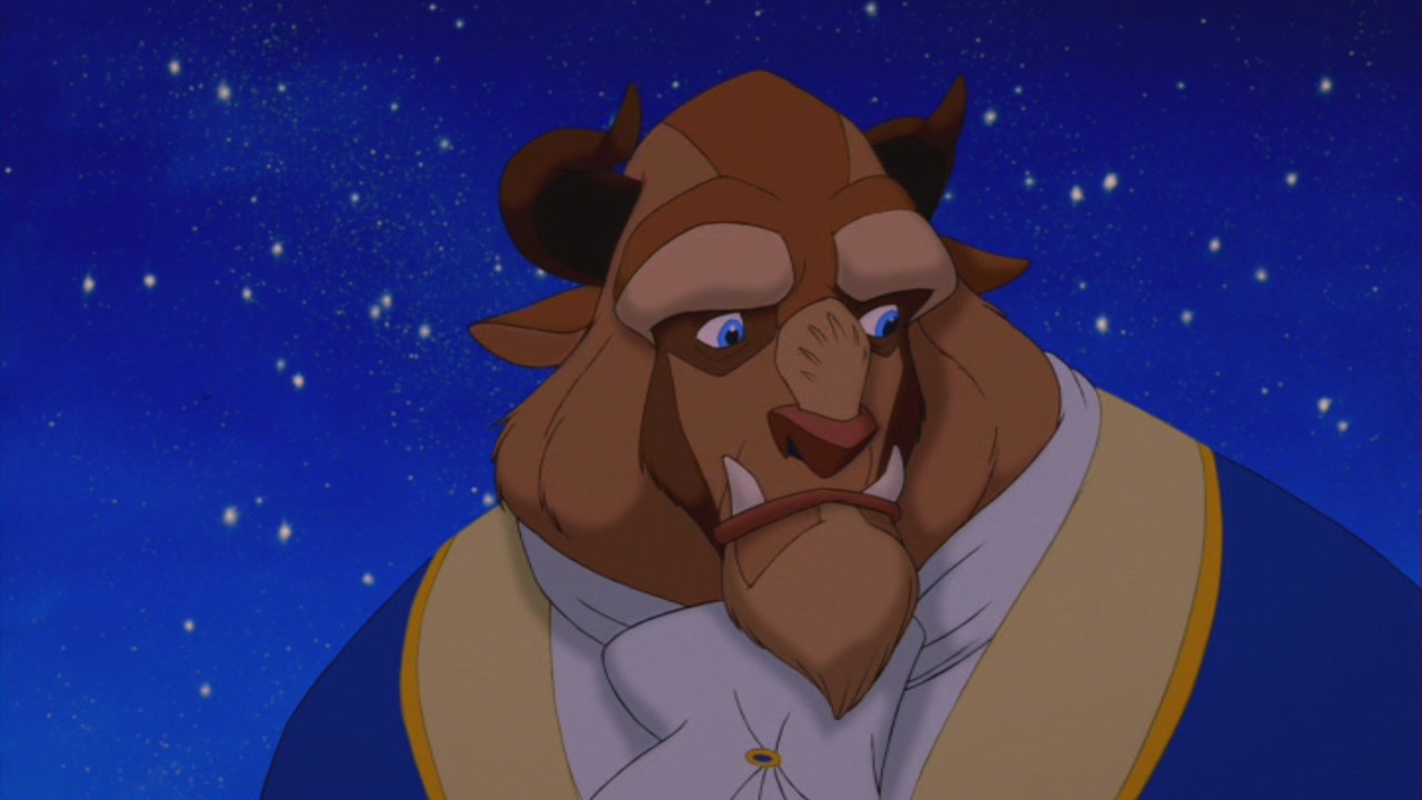
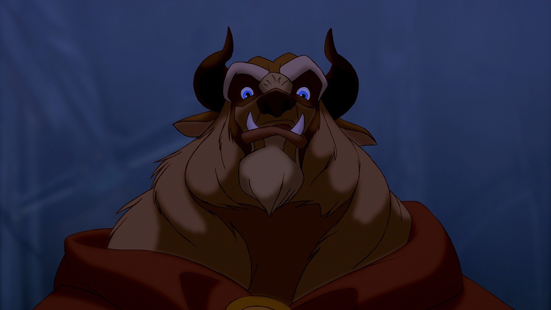
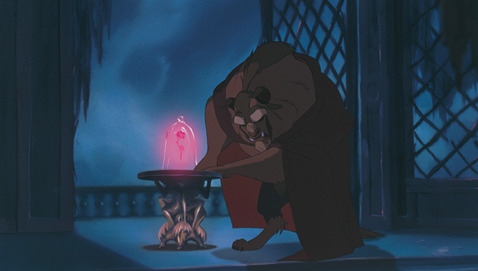
Beast- Beauty and the Beast, 1991 (Designer Glen Keane)
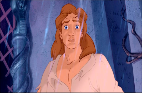
Glen Keane stated, “I compare Tarzan with the Beast, in a way. Beast is an animal on the outside with a man on the inside wanting to come out. Tarzan is a man on the outside with an animal spirit. . . Both have a journey, a discovery, and a transformation at the end.” Thinking that way, it is no wonder that Tarzan and Beast peaked at the top of my list in design.
I have a insatiable hunger for character’s who display the true origins of the human spirit, especially when faced with physical limitations. I love Gwynplaine from The Man Who Laughs (1928) and Erik from The Phantom of the Opera (1910) for a similar reason. Romanticism in all its dark glory reveled in this idea of dualism, where one’s ugly or bestial appearance masks a beautiful soul.

Though Tarzan and Beast are so similar, I love Beast’s design more. Though Tarzan may have been just a little harder to animate I believe designing Beast was infinitely more complex. This is a character that must show the man trapped beneath the monster, one whose design took months to conceive and five animals to fully complete. Kirk Wise, who worked as one of the director’s of Beauty and the Beast commented in regards to Keane’s design, “He can draw powerful, volatile, massive creatures. But the neat things about Glen, which he showed with Ariel, was his tremendous restraint. He’s got so much control over his craft he’s able to imbue this massive, beastly character with a believable human soul.” (emphasis added) (pg 96, Tale as Old as Time by Charles Solomon).

There is so much I love about this design I do not know where to begin. I remarked in my review for the film,
In my opinion, Beast’s design is Glen Keane’s triumph. He not only created a character that was visually stunning (his appearance is monstrous yet still aesthetically pleasing) but also triumphantly showed the young man trapped inside Beast’s body. For example, subtle movements in his face, hands and body language remarkably conveyed his uncomfortable response to Belle’s grief at losing her father, just like a young man unused to and perhaps insensitive to a young woman’s emotional outburst.
If I were to narrow it down to my favorite thing it would again have to be the eyes. There is such depth and truth to feeling hidden there!
Again, from my review I stated,
It was through Beast’s eyes, however, that Keane captured his character and depth most intensely. His eyes mirrored the discouraged young man hidden behind Beast’s terrifying exterior. Near the beginning, his eyes flashed with anger and hopelessness. Then, as the film progressed and his relationship with Belle deepened, they softened and showed rather than frustration deep abiding love.
I also love the design for Beast’s human form. It is strangely reminiscent of men portrayed in Romantic paintings like “The Lament of Icarus” by Herbert James Draper. Many do not like his human design but I think that is only because they grew so attached to him as a beast.


Thank you so much for reading my posts for character designs. I have listed below the other lists starting from 50-41 and I promise to write a lot more in the future,since I am no longer working. (Thank you summer!)
Character Design 50-41, Character Design 40-31, Character Design 30-21, Character Design 20-11

3 Comments