

In this article, I will explain how style, backgrounds, and character designs create the look of any given animated film.
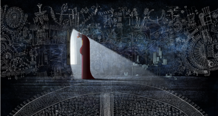
Vision, the design or style to match the story
Once animators have a story in mind, it is pivotal to strive for a particular artistic style or VISION to tell it well. Ralph Bakshi, who directed animated films like Fritz the Cat (1972), and The Lord of the Rings (1978), once said, “Animation is both technique and story together, that’s why I love animation. In other words, you have to find the style that tells your story with impact.” (“Ralph Bashki Animation’s New Wave” Anymation). This impact is the overall impression that will either aide the story animators try to tell or hinder it.
To have an impressionable style is less about being exclusive and more about being bold. It is how great films like Spirited Away (2001), The Star Wars Trilogy (1977-1983), and The Lion King (1994) garnered praise. At the core of every film like these are artists. Artists created a visionary glimpse into brave new worlds only achieved through cinema. That is what creates healthy artistic diversity. And if there is diversity between animated films, artistry flourishes.


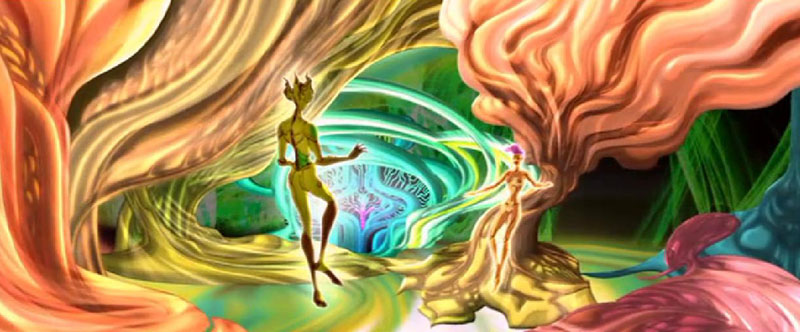
Animated films without a focused style that fits their stories lose grasp on their overall vision. One example of this is The Animatrix (2003). Directed by the Wachowskis, it is a compilation of nine animated shorts based on The Matrix trilogy. Each of the shorts individually has a beautiful tone and vision. However, if viewed successively as a whole, they lose balance because they don’t have the same vision. This is because the style is jarringly different for each short. Some are 3D animated, and others 2D. None of them feel like they are from the same genre. For example, one feels like a historical Japanese play, a second a psychological horror, and another could be mistaken for a film noir. Consequently, all the shorts collided with each other. Because their styles differed so remarkably, they could not coexist cohesively in the same movie.


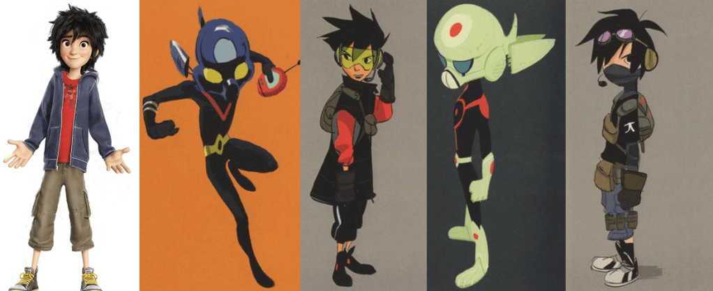
Sometimes there are exceptions to this rule, but that only works if it fits into the story frame. In Spiderman: Into the Spiderverse (2018), several of the characters came from different dimensions. Therefore, their character design and homeworlds had different styles. But they were supposed to feel like they didn’t quite belong. However, they didn’t differ to the point of needless distraction. Because they came from a comic book world, their styles could coexist well based on how animators blended their movements through precise animation. They purposefully harmonized their unique characteristics to fit the multidimensional theme of the movie.
Spider Ham, A more cartoony style 
Peter B. Parker, Softer and Warmer Lines 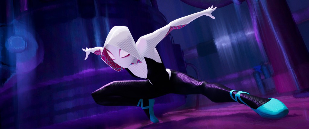
Spider Gwen, More Neon and less definition in backgrounds 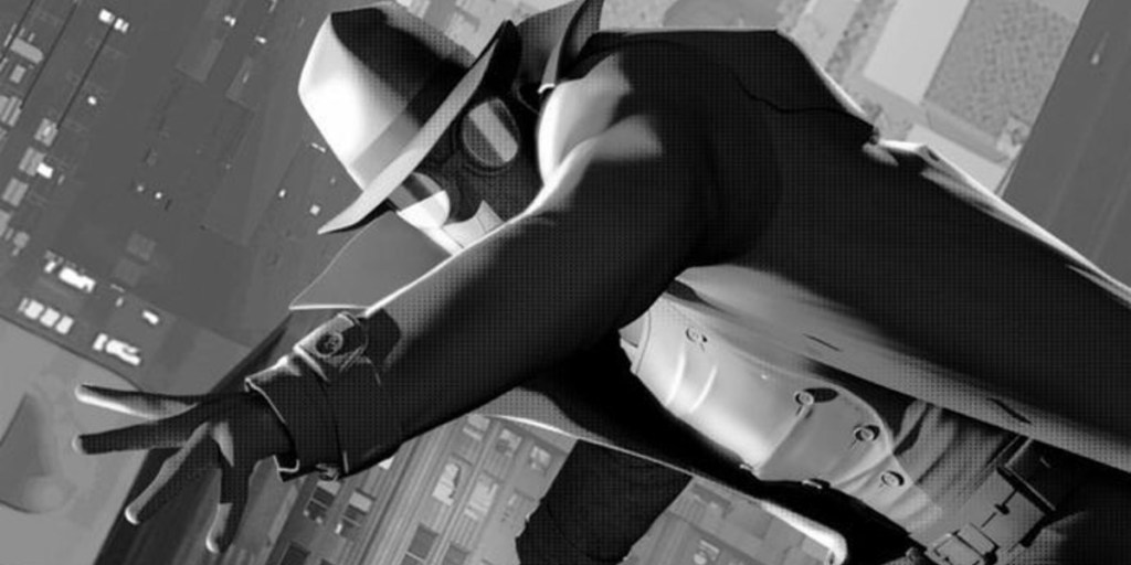
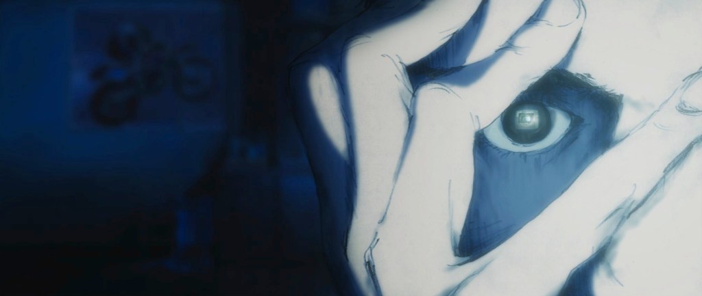
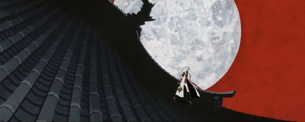
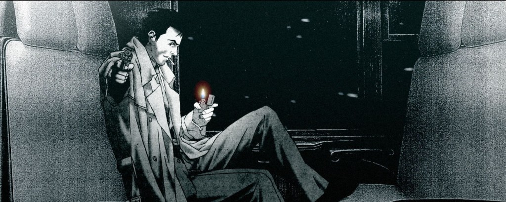
Spider Noir, Black and White More 40’s comic style 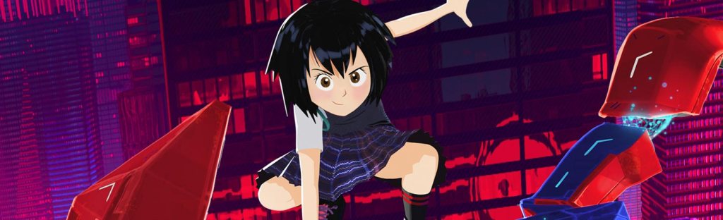
Peni Parker, Anime with crisp colors and more dramatic design 
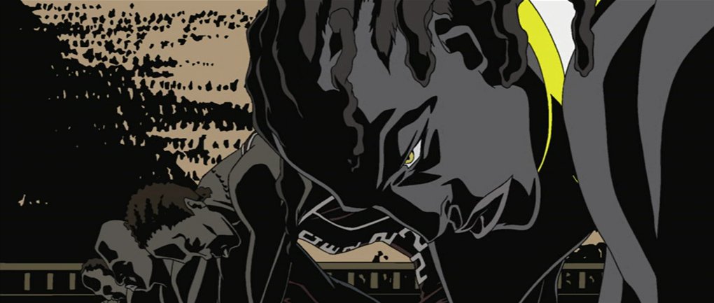
Miles Morales, Graphic Design and style 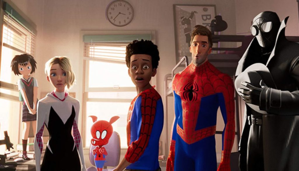
It takes detailed research to layout and create an effective story. A film’s overall vision is conveyed most vividly through backgrounds and character designs. This means how a scene looks in its backgrounds and character designs plays a major factor in the film’s overall mood and dimension.

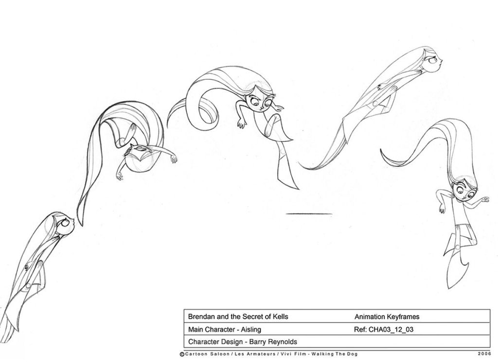
Character Design, that which draws our eyes
Character design is the second aspect of creating an animated film’s look. Characters are the agents who lead audiences through a story. There are two important aspects of character animation. The first is creating visual appeal through well-rounded character design. The second is using a character to move and enhance the story through good characterization. This section will focus primarily on character design.
Characters are a story’s main focal point. In painting and drawing, artists use focal points to create balance, perspective, and meaning in their artwork. Animators do the same thing when laying out and designing their characters. It is important to have visually balanced character designs for each shot in an animated film. Kim Morrisey explained,
While backgrounds and character designs are equally important when it comes to the aesthetics of animation, audiences generally remember the characters first and foremost – and not without good reason. Characters, in most cases, are the animation. They are the images that move. Because they are so pivotal to the success of a commercial anime, characters are usually placed in the foreground of any given shot.
Kim Morrisey, The Basics of the Animated Mise-en-scène
Characters become the audience’s focus when watching a film, and if the appeal is right, it can make all the difference in its success. They are the primary reason films like Frozen (2013), The Lego Movie (2014), and The Nightmare Before Christmas (1993) earned so much money in and out of theaters. In an article about design, Leonardo explained how character designs are,
. . . especially crucial as a story element that drives the narrative and experience of a viewer, reader, player, or user. (They are) meant to make interactions more familiar, and help you relate to what’s being presented in front of you, generating emotions and immersion.”
Leonardo, The importance of immersive character design and world-building


At the heart of good character design is Appeal, an animation principle penned by Disney legends Frank Thomas and Ollie Johnson. To make an animated character visually appealing doesn’t necessarily mean they are beautiful. It means their design is interesting. Animators can give their characters a dynamic design using a wide variety of shapes and proportions, finding and exaggerating visual characteristics that define their personality, and keeping their design simple. By doing this, animators mold characters that don’t distract or confuse a viewer but create excitement and expectations for the story.
How animators design characters tells viewers about more than what they look like. Depending on how they use colors, shapes, arcs, and other details in the design, an audience can know a character’s personality or even parts of their deeper story at a glance. Sometimes, animators choose to exaggerate specific parts of the design which define a character’s personality.


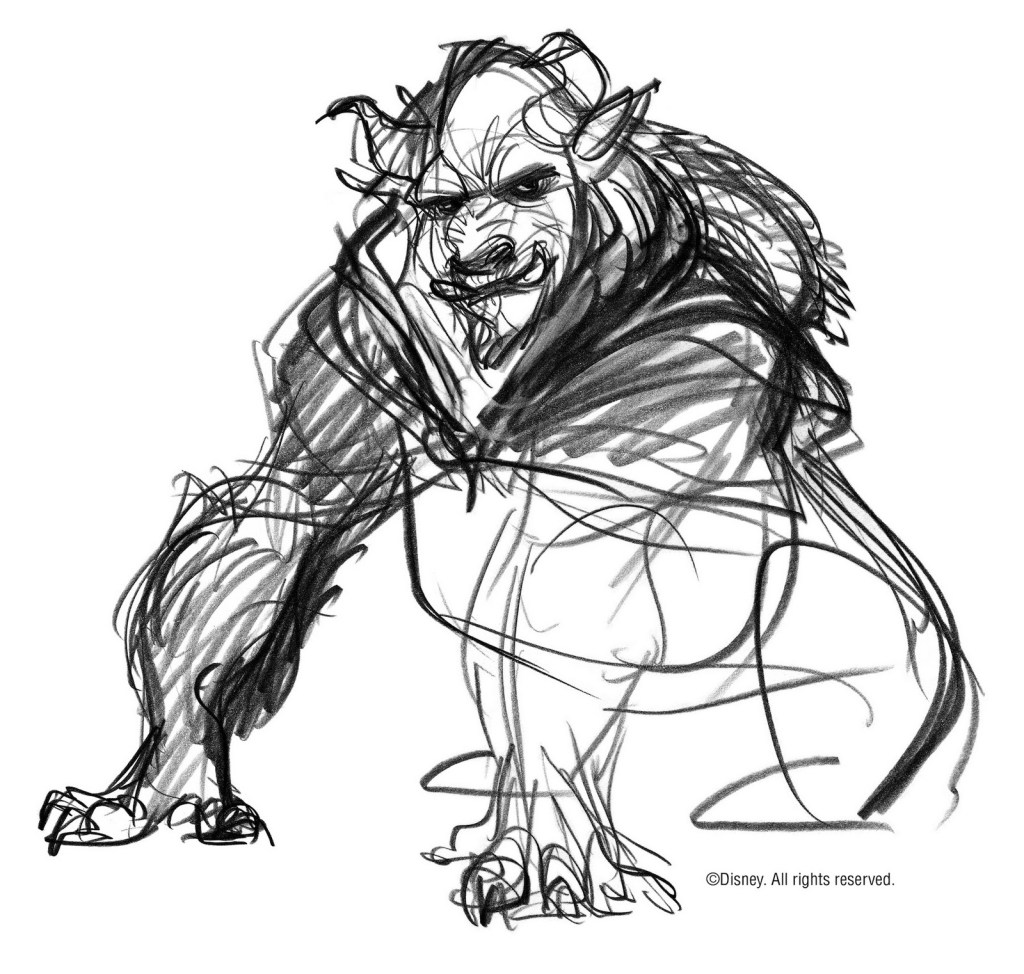
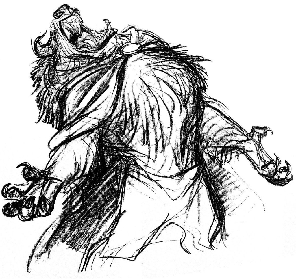


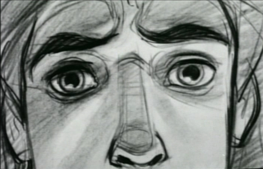
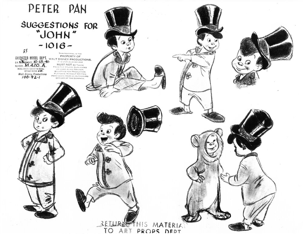
Glen Keane’s Beast from Beauty and the Beast (1990) is one example of well-balanced character design. Keane stated, “I believe a character exists before you start to draw it. Like it’s meant to be. And you’re just trying to find him.” For Beast, Keane envisioned a prince trapped in a beast’s body, not a strange alien creature or a brutish figure. He not only created a visually stunning character (his design is monstrous yet still aesthetically pleasing) but also triumphantly showed the young man trapped inside Beast’s body. For example, subtle movements in his face, hands, and body language remarkably conveyed his uncomfortable response to Belle’s grief at losing her father, just like a young man unused to and perhaps insensitive to a young woman’s emotional outburst.
To make this design believable, Keane combined common features from a wolf, gorilla, buffalo, bear, and cow to give him the size and formidable traits expected of a beast. But then he gave Beast expressive human eyes to remind the audience that he was a man. Keane captured Beast’s character and depth most intensely through his eyes. Beast’s eyes mirrored a discouraged young man hidden behind a terrifying exterior. Near the beginning of the film, his eyes flashed with anger and hopelessness. Then, as the film progressed and his relationship with Belle deepened, they softened and showed rather than frustration deep, abiding love. It was a design that evolved as Beast matured and changed.
Kirk Wise, who worked as one of the director’s of Beauty and the Beast commented in regards to Keane’s design,
He can draw powerful, volatile, massive creatures. But the neat things about Glen, which he showed with Ariel, was his tremendous restraint. He’s got so much control over his craft he’s able to imbue this massive, beastly character with a believable human soul.
Kirk Wise, Tale as Old as Time: The Art and Making of Beauty and the Beast by Charles Solomon
Infusing a character with human characteristics through their design helps an audience better identify and attach to an animated film. Characters partner with backgrounds to create a realistic and interesting story. Leonardo from demodern.com noted, “What would all of those characters be if you do not create a world that gives life to and fulfills their purpose? The relationship between both characters and the world is where things get very interesting and fun.”

Backgrounds, framing visual atmosphere
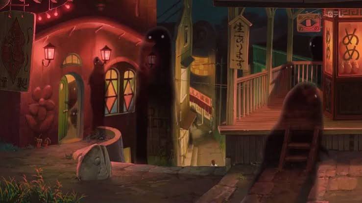
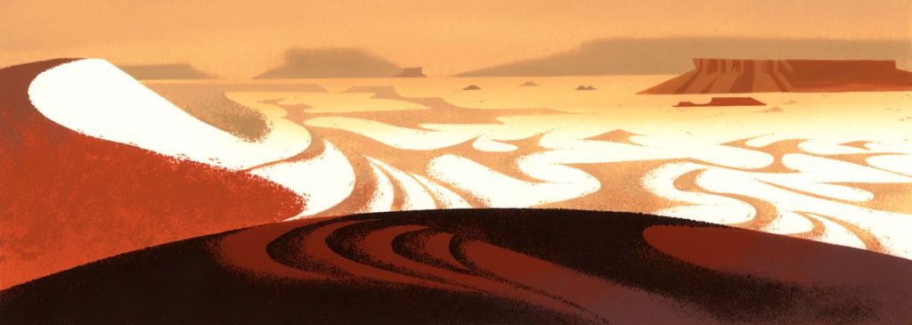
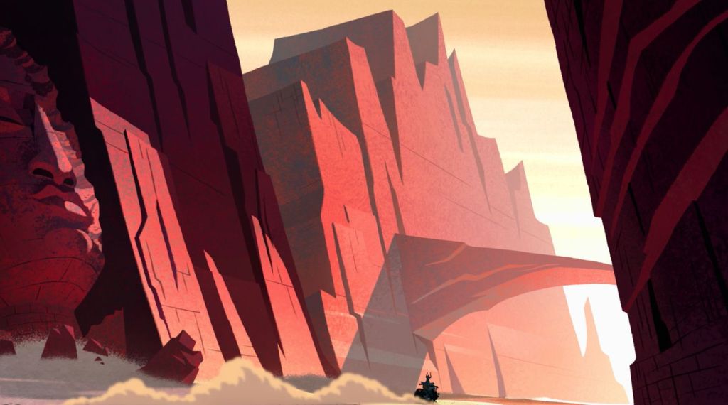
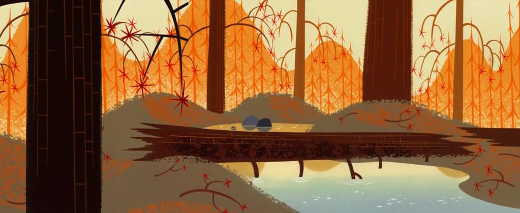
Backgrounds are an essential part of worldbuilding in animation because they establish location and tone for each scene. Designers build backgrounds that establish the film’s location and atmosphere, a visual marker for the story they want to tell. Anime critique and researcher Kim Morossy explained, “. . . the backgrounds are an integral part of establishing an anime’s world or overall aesthetic. They are designed as the director is attempting to feel out the anime’s story, world and themes.” (Kim Morossy, The Basics of the Animated Mise-en-scène)
The best backgrounds not only show where a story takes place but provoke questions which in turn pique viewer’s curiosity. Consequently, they invite viewers to be more active participants in the story. Irish film critique Cole Delaney observed in his video essay on animation director Tomm Moore’s work,
Background design often serves to answer a series of questions, one’s we are not even aware of asking. ‘Where are we?’ ‘What’s happening in the story now?’. . . I find that the best backgrounds force me to ask questions. The minutia of details inspires me to think of the greater world and my imagination motifs in more questions as I look for answers.
Anymation, Tomm Moore | A Deeper Perspective
At a deeper level, backgrounds can evoke a sense of WONDER. Utilizing colors, shapes, and space into these backgrounds plays an integral part in how animators create immersing cinematic experiences. Hamish Thompson noted in an article on Disney animation, “Setting and background in Animated feature films are fundamental in creating a world that is realistic or natural.” (Hamish Thompson Snow White and the Seven Dwarfs and Beauty and the Beast, Milestones in Genre). At their heart, artists create backgrounds draw attention to the characters and give meaning to their actions and reactions.

In the miniseries Over the Garden Wall (2014), director Patrick McHale and others drew from old postcards, folktales, and cartoons to create a mysterious world their main characters Greg and Wirt could be lost in.
In Michael Dante DiMartino and Bryan Konietzko‘s Avatar: The Last Airbender (2004-2008), designers studied and drew from Japanese, Chinese, Indian, and Inuit cultures to create fantastic backgrounds rooted in history.
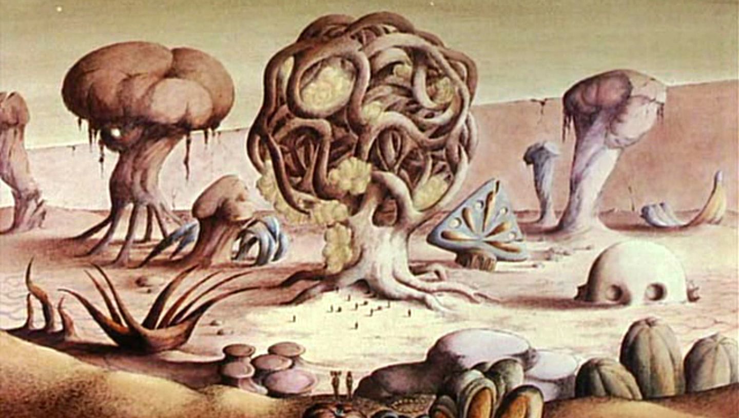
Animated films like René Laloux and Roland Topor‘s Fantastic Planet (1973) have jarringly abstract backgrounds that portray a disorienting, dystopian world. It is easy to empathize with the captured human’s despair and confusion because of these striking backgrounds.
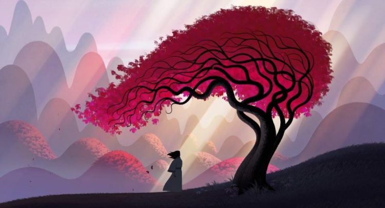


Some of the best animated background work is in Genndy Tarkovsky’s animated series Samurai Jack (2001-2004, 2017). “One of animation’s most stylistically resonant shows” (Nerdstalgic, How Samurai Jack Mastered The Art of “Nothing”), Tarkovsky’s Samurai Jack prioritized showing rather than telling. To do this, he used a minimalistic art style and spent extra time creating beautiful and mesmerizing backgrounds. Each episode took its time to introduce the setting and animators built tension and anticipation on that imagery rather than on dialogue. Animation visual journalist Cole Delaney spoke on how Tartakovsky used backgrounds to frame the mood of each episode. He noted, “The environment is observed before the characters enter it and either disrupt or pass through it. . . The world that exists allows us to focus attentively on where the characters will appear.” (Cole Delaney, Genndy Tartakovsky | Reading the Action)
Episode 7 from Season 1, “The Three Blind Archers.” illustrates this integral connection between the backgrounds, characters, and story. The episode opens in a quiet autumn scene and shifts to a massacre between an army and three archers atop a tower, who guard a wishing well. When Jack comes across the survivors, he learns of the well and sets out to find it. As he walks, he passes warning signs, bodies, and trees now shrouded in snow and silence. When he finds the tower and moves to meet the archers, he quickly learns he can’t face the them like other foes. Jack, to understand and fight them, blindfolds himself letting his sight go dark. When Jack loses his sight, the screen goes black. Colors and figures appear on the black background to symbolize Jack’s journey to understanding and honing a world centered on sound. Eventually the backgrounds change from black to vivid imagery, visual because of what he hears rather then what he sees.
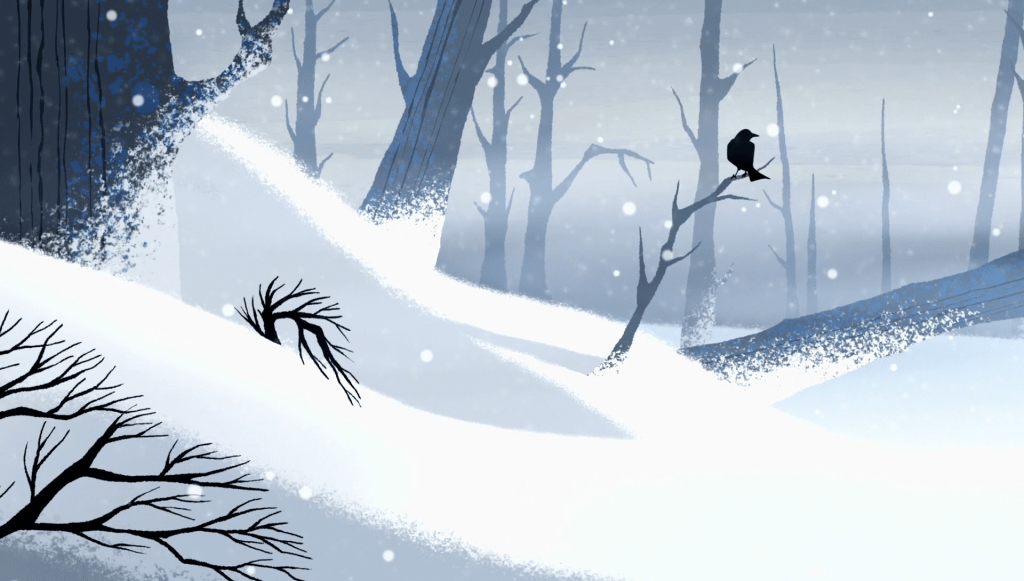


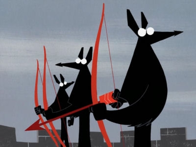
What is most remarkable about this episode is how it pulls in its audience with hardly any dialogue. Because imagery drove it, its story was more immersive. Snow and wintry silence cushioned moments of tension and release through the episode’s most remarkable moments. Any sound heard held immense meaning. All in all, the hypnotic backgrounds coupled with meticulously stylized animation invited each watcher to “stop being a passive viewer and engage with the show” (Nerstalgic). Not only that, but each frame on Jack’s confrontation with the archers made it feel like Jack was USING the environment and not just being in it. It truly bridged “the gap between near silent artistry and nuclear action.” (Cole Delaney, Genndy Tartakovsky | Reading the Action).
Conclusion
How a film looks sets an audience’s expectations for its story. That is why film companies put so much emphasis on movie trailers and posters. A movie’s appeal comes firstly by formulated images that set the mood/tone of any particular story. Screenwriter Anthony Ehlers said,
One could theorise that readers ‘see’ stories first – striking, moving pictures in the imagination that come alive in the mind’s eye. . . images bring stories and characters to life. I would go so far as to say that all stories are primarily visual. . . Visual storytelling helps you show and not tell. If you can show the world of your characters, the story becomes relatable and you create empathy in the reader.
Anthony Ehlers, “10 Powerful Visual Storytelling Techniques for Writers
Next post will cover Flow, comprehensible pacing made possible through a compelling narrative, dynamic and necessary characters, focus and timing.
For those interested, below are several videos related to topics I discussed throughout this post. Thank you for reading!
Make a one-time donation
Make a monthly donation
Make a yearly donation
Choose an amount
Or enter a custom amount
Your contribution is appreciated.
Your contribution is appreciated.
Your contribution is appreciated.

I learned a lot from this post. Really appreciate your writing and thought. There is indeed so much work that goes into these animations. Very well done!
Thank you so much for reading!
Wonderful!
Thank you so much for reading!
You are welcome. Regards 🙏